BAUHAUS FUTURE FICTION DIAGRAM
Corporate Identity
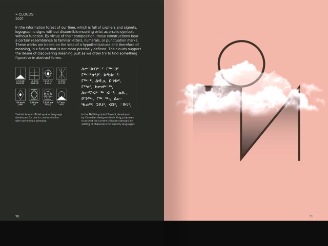
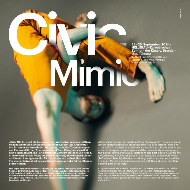
BFF is an experminal art and design class that incorporates spiritual attitudes such as cosmology, future knowledge and mindset while focusing on material attitudes such as hospitality, cooking, nutrition and foreknowledge. Bauhaus Future Fiction also deals with artistic interventions on themes of alchemy.
The first Workshop was realized in Tainan, Taiwan. 2023
GERMAN DESIGN AWARD 2022
As part of the celebrations, a campaign will be developed by Studio Markus Weisbeck and Oliver Hardt, which will examine the complexity of design tasks from the point of view of “how designers think”. Inspired by the work of designer and theorist Horst Rittel, who in the seventies and together with Melvin Webber coined the term “Wicked Problems”, it intends to pay homage to the process and nature of design thinking and its consequent performance: how solutions can be found for challenges that are unclear, contradictory, volatile and even insoluble? Or at least for those who seem to be like that? In an era of growing challenges such as climate change, the pandemic and data flows, design clearly plays a key role in solving tasks that involve society as a whole.
MIKE BOUCHET TENDER
Editorial Design
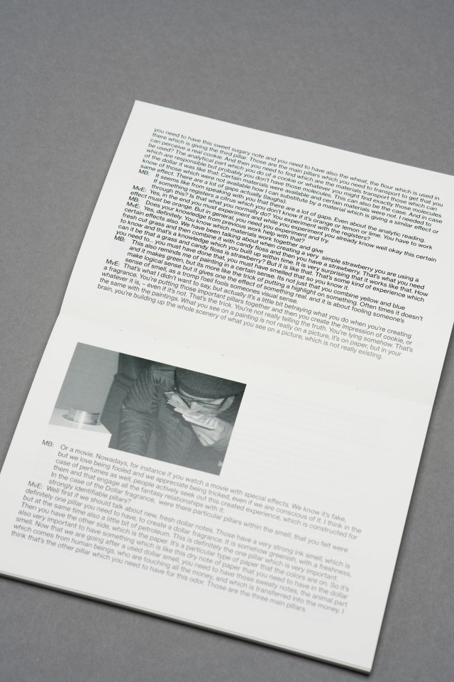
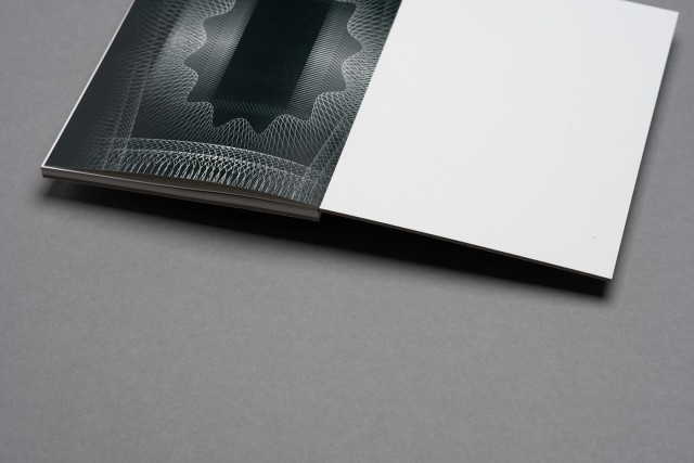
Marlborough is pleased to present Tender, a sculpture by Mike Bouchet and his second solo exhibition with this gallery. Occupying the entire 45,000 cubic feet of gallery space, Tender is the synthesized fragrance of US Dollar bills. Although invisible, the sculpture, in fact, fills every molecule of the space. This publication follows the idea of the US dollar note and completes the theme with specially produced printing ink that smells like money.
GERMAN DESIGN AWARD 2023
Digital campaign in collaboration with Oliver Hardt Based on TouchDesigner structures my Mariko Neumeister, des Design Award was framed by a live Set by Sophia Kennedy. The basic designs are based on fruits and vegetables.
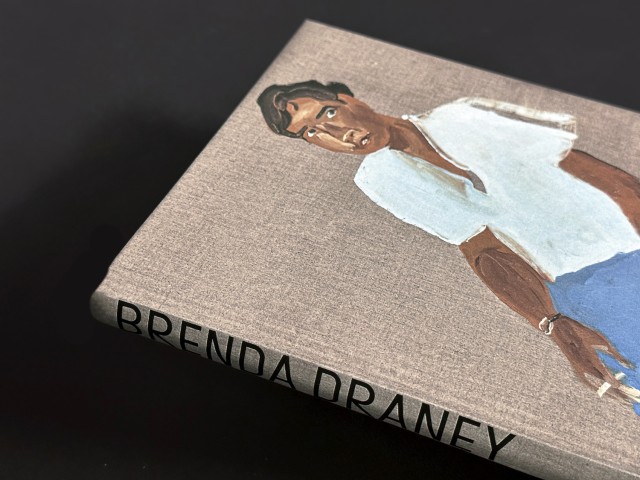
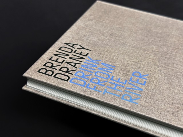
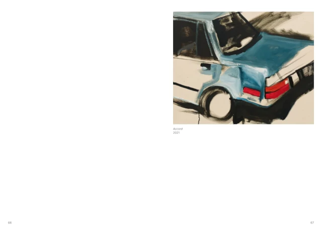
BRENDA DRANEY, DRINK FROM THE RIVER
Editorial Design
This richly illustrated catalogue—published in conjunction with Draney’s solo exhibition organized by The Power Plant Art Gallery in Toronto—features a selection of existing and newly commissioned works and original contributions from Canadian scholars and writers.
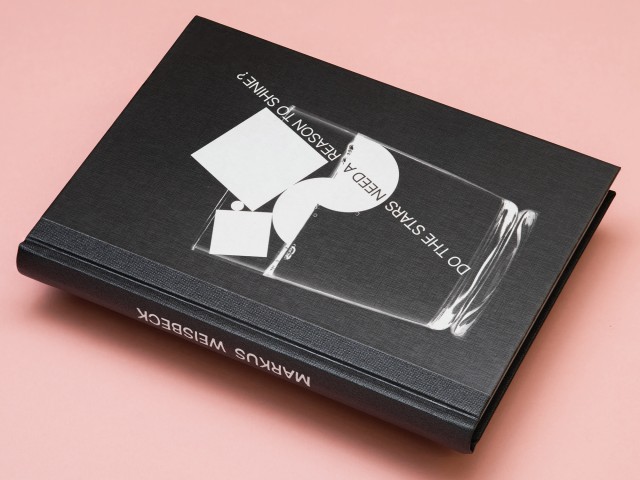
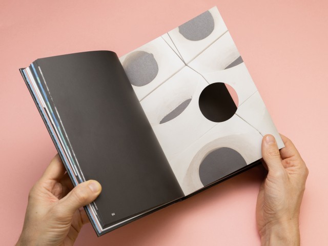
DO THE STARS NEED A REASON TO SHINE?
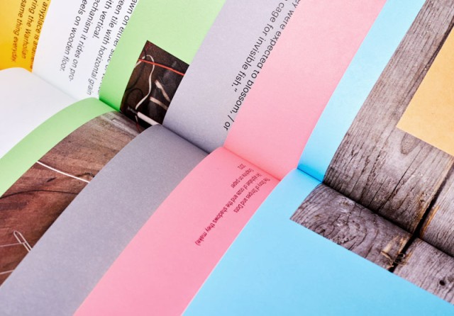
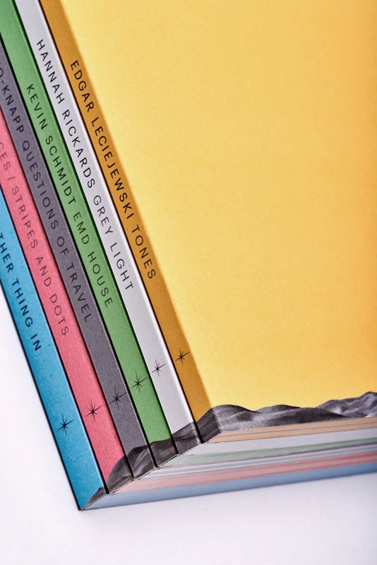
This book presents eighteen visual works created between 2011 and 2022. Most of the designs are predicated on the principle of improvisational loops. Interim results are repeatedly tested and varied until a final theme and form emerge from the process. Weisbeck also applies this mode of thinking, which is quite familiar to designers, outside the parameters of commissioned work: the results of his ongoing visual research are presented here in context. 189 pp., 230 colour illustrations, threadsewn hardcover, ISBN: 9783959056380 Spector Books
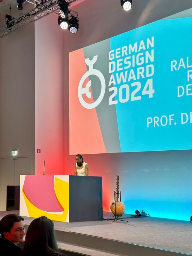
GERMAN DESIGN AWARD 2024
The award design for the German Design Award is based on a color surface scale and new graphic forms in which the winners' images and films are embedded. In collaboration with Oliver Hardt, two accompanying music videos were created. One was made entirely with Prompts and AI technology, while the other was based on sculptures by the Artist Christina Kral, forming the basis of a variable type composition.
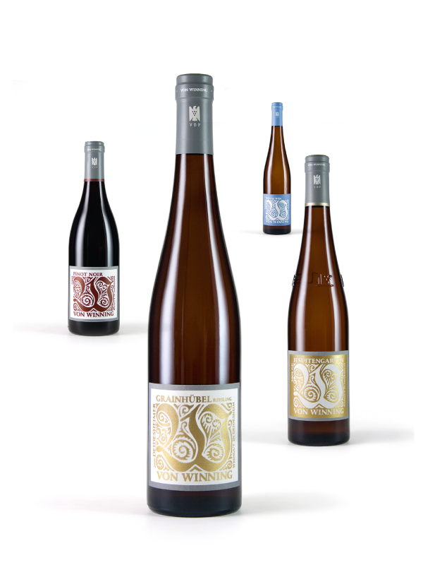
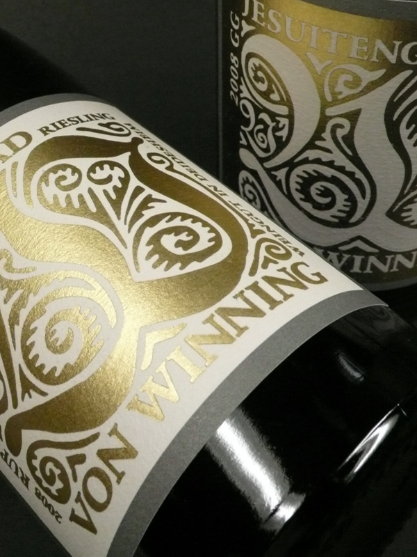
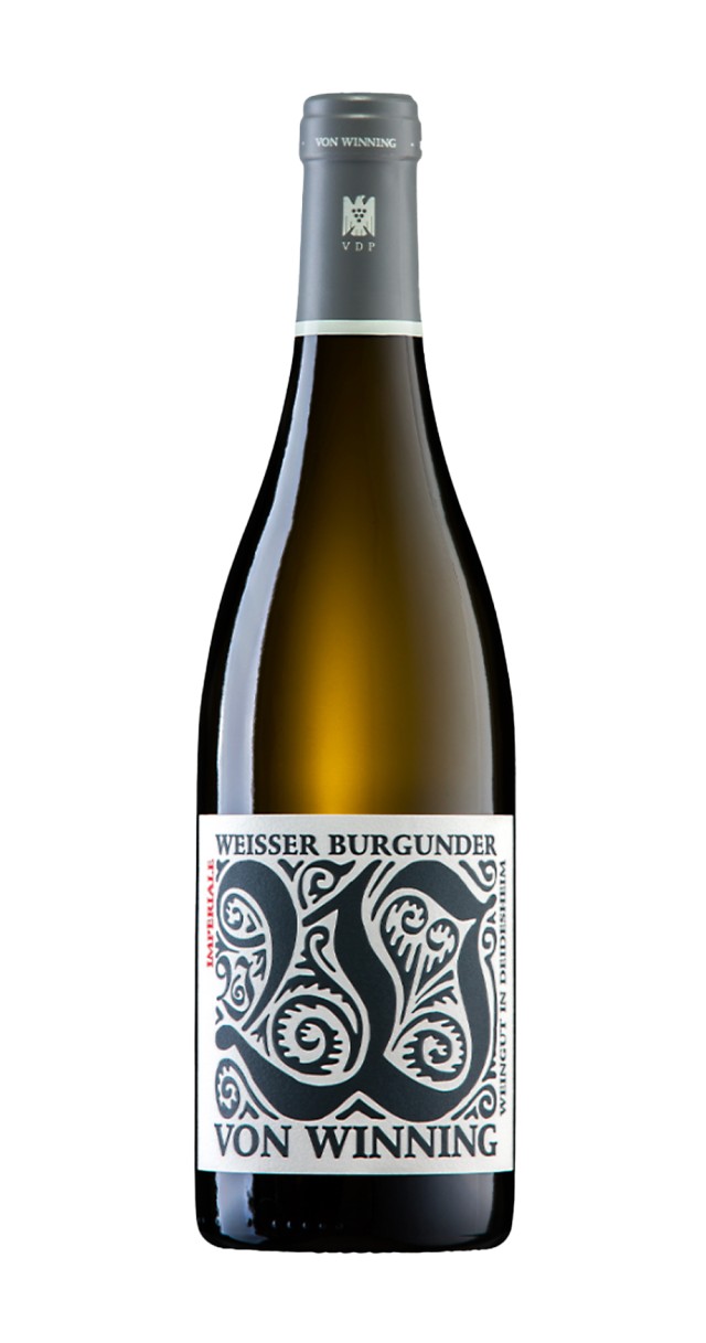
WEINGUT VON WINNING
Corporate Design
For the traditional vineyard Dr. Deinhard in Deidesheim the new corporate design “von Winning” was created. The unusual vine stock growing in the renowned area demanded a traditional as well as an exclusive solution, based on the typographical use of “Ehmke-Ornament-Initials” in combination with the font “Stempel Schneidler”, as a reference to the epoch the vineyard label was founded.
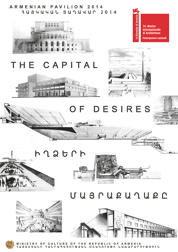
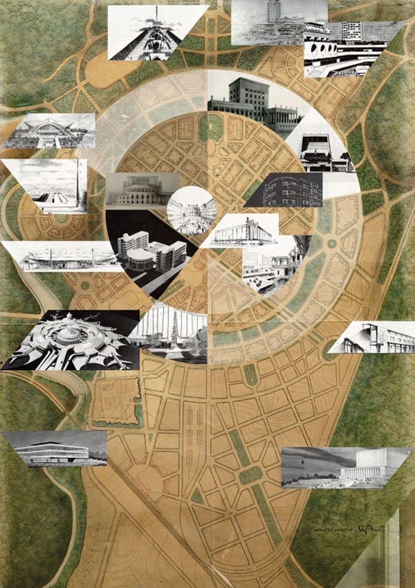
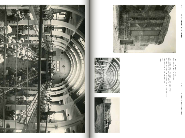
THE CAPITAL OF DESIRES
Corporate Design, Book Design
The key visual for the pavilion of Republic of Armenia at the 14th International Architecture Exhibition in Venice is based on a selection of hand drawn Armenian architecture.
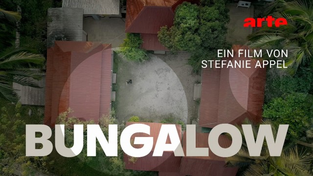
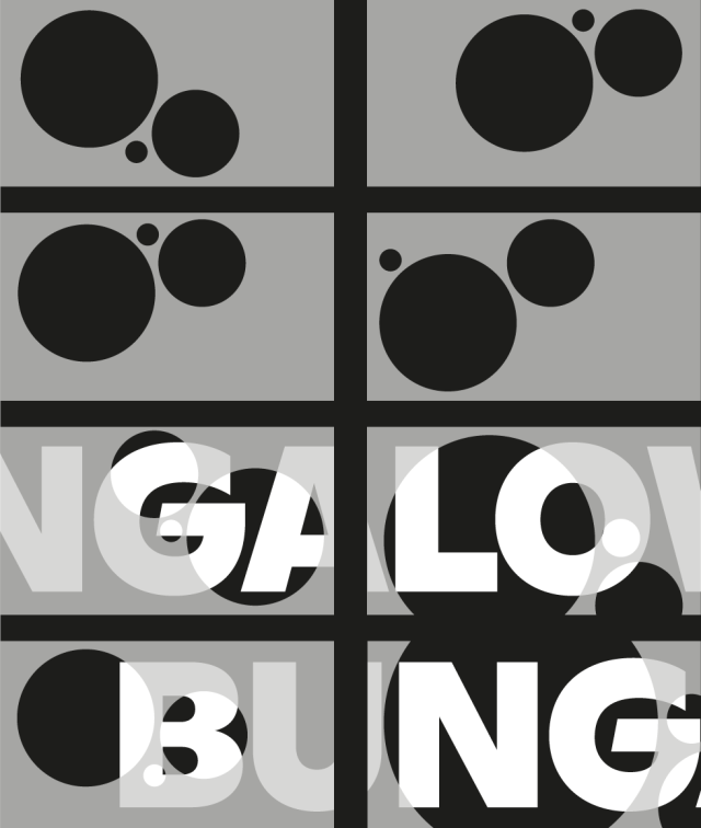
BUNGALOW
Title Design
The title design of the film production “Bungalow” for ARTE/HR is based on the design idea of Armin Hoffmann’s methodical exercises for graphic arts classes at the arts and crafts department of the Allgemeine Gewerbeschule Basel. These kinetic movements mask the start and end sequences of Stefanie Appel’s film as a composition with the typographic elements.
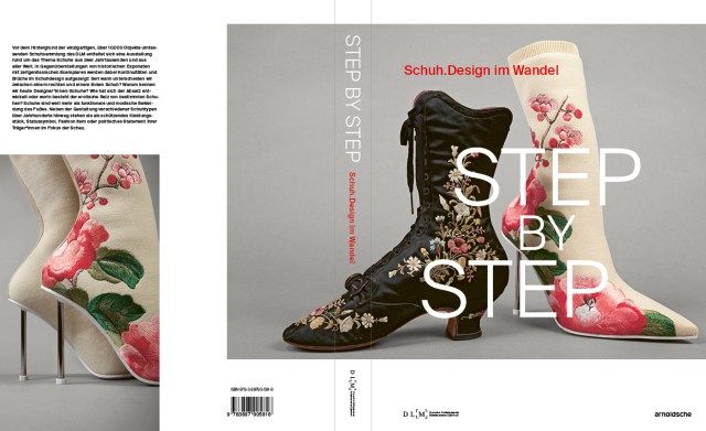
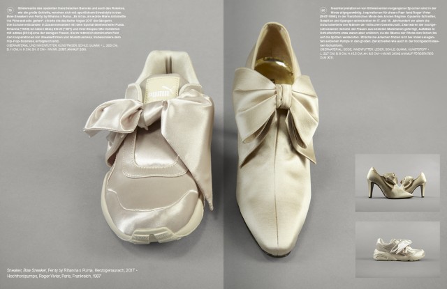
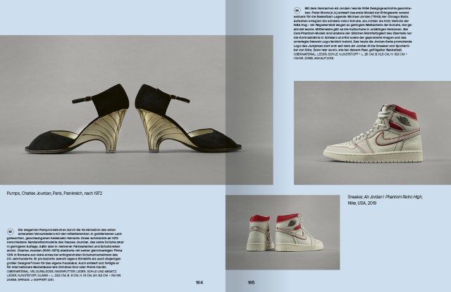
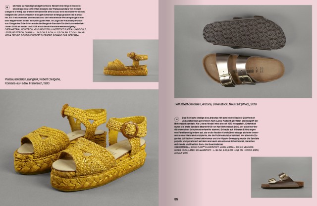
DEUTSCHES LEDERMUSEUM, STEP BY STEP
Publication, Editorial Design
Against the background of the unique shoe collection of the DLM, STEP BY STEP: Shoe Design in Transition unfolds an exhibition about shoes across all continents and through all times. The focus of the show is on the development and design of different types of shoes. Historical exhibits are deliberately combined with examples from the second half of the 20th or 21st century in order to accentuate and show both continuities and breaks in the development of the shoe and shoe design. Over 150 selected shoes or pairs of shoes illustrate the breadth of the collection and impressively trace the cultural history of footwear. Deutsches Ledermuseum
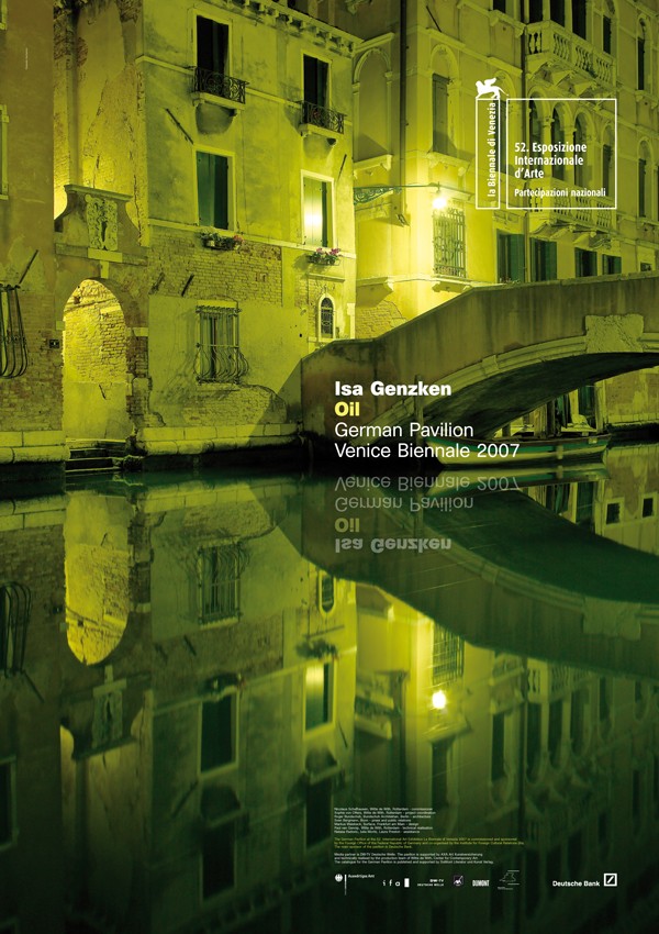
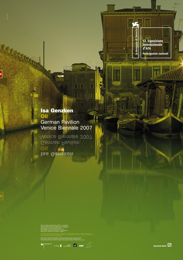
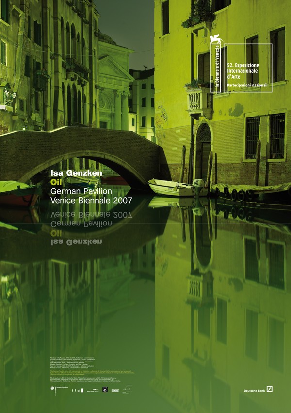
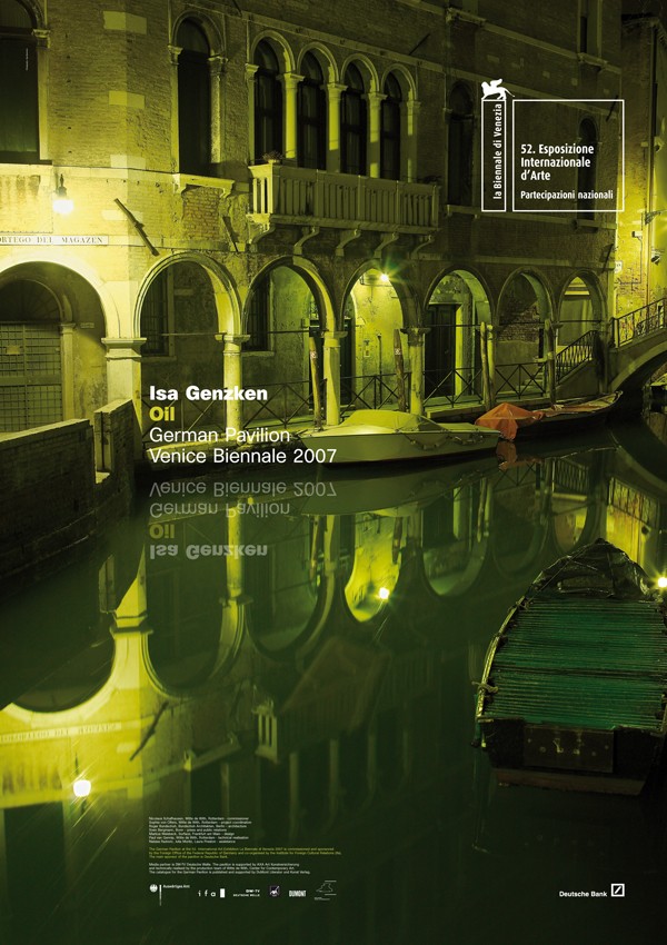
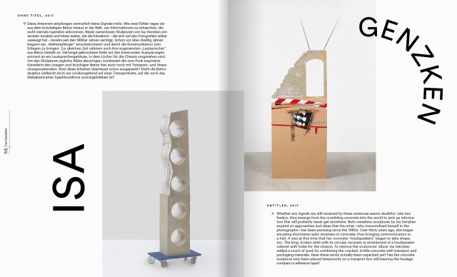
ISA GENZKEN, BIENNALE DI VENEZIA 2007
Corporate Campaign
The campaign for the German Pavilion of the 52. Venice Biennale illustrates specific excerpts of Venice, similar to Isa Genzken’s artistic style in her installation “Oil”. Thus, the image of the campaign is a reference to the cliché of the lagoon city just like the artistic contribution in the pavilion and cites that part of the work that uses similar reflections. Ordered were: advertisements, large-scale posters as well as an internet website. Photography by Jörg Baumann.
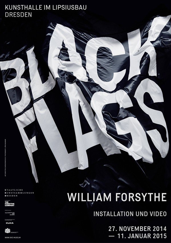
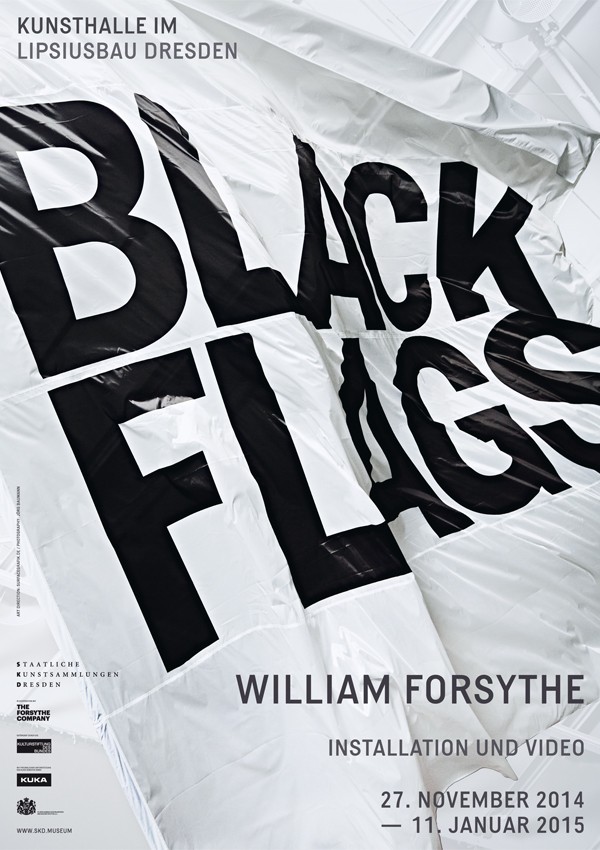
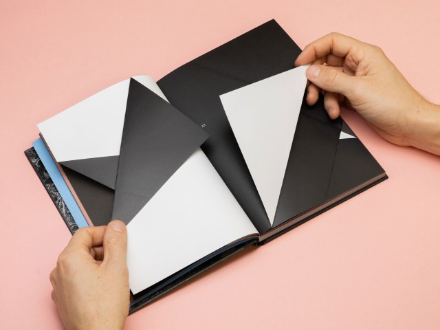
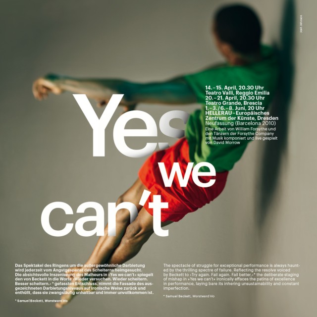
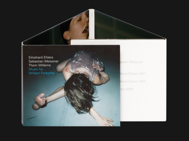
BLACK FLAGS
Posters
Posters for William Forsythe’s exhibition at Staatliche Kunstsammlungen Dresden.
In the ‘white cube’ of the Kunsthalle in the Lipsiusbau, two industrial robots wave enormous black flags, accompanied by the operating noise of the robots and their continuous movements.
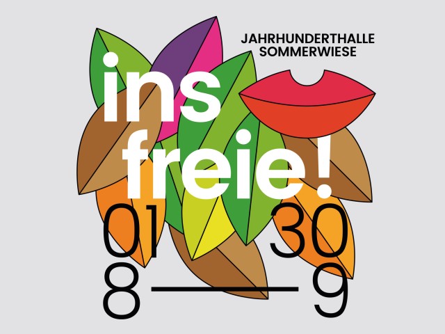
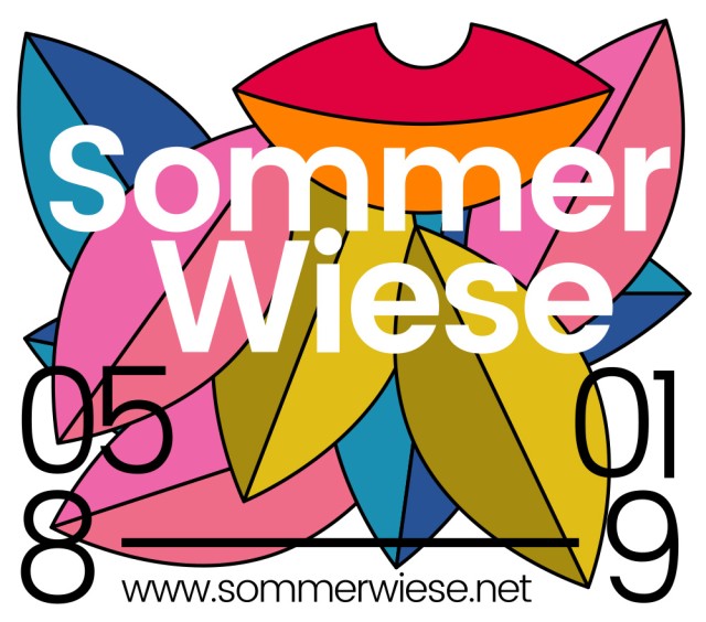
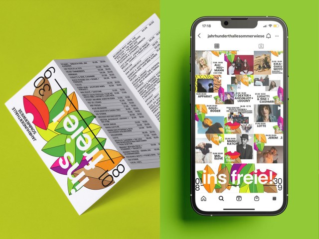
SOMMERWIESE INSFREIE!
Corporate Design, Festival
The Sommerwiese was an open-air music festival that took place three times in front of the iconic Jahrhunderthalle in Frankfurt-Höchst. The visual design is made up of graphic elements from the wall design developed in 1977 by Frankfurt designer Wolfgang Schmidt (1929-1995) for the Orangerie restaurant in Darmstadt. by Jourdan & Müller - PAS
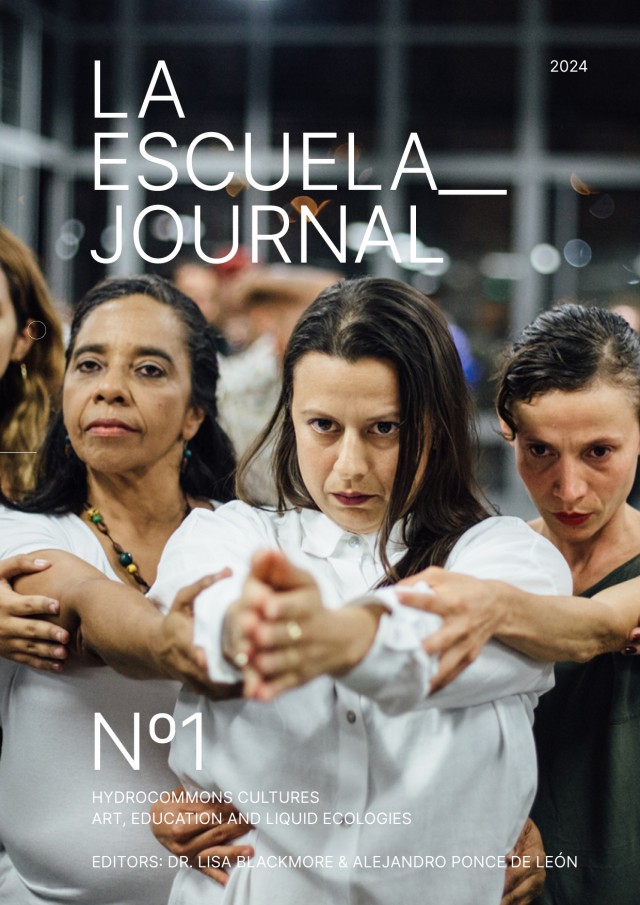
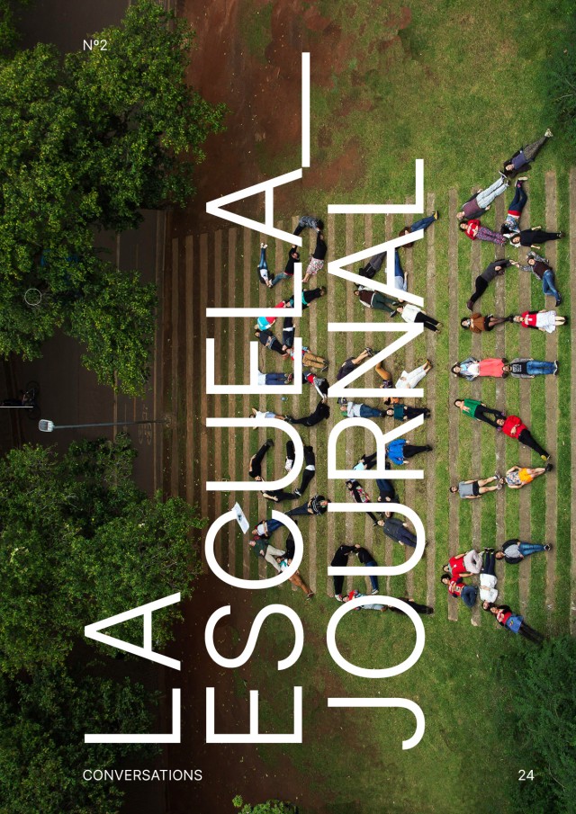
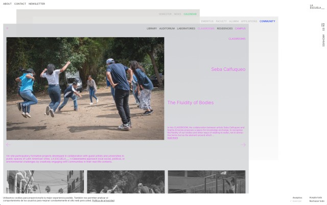
LA ESCUELA___
Online platform
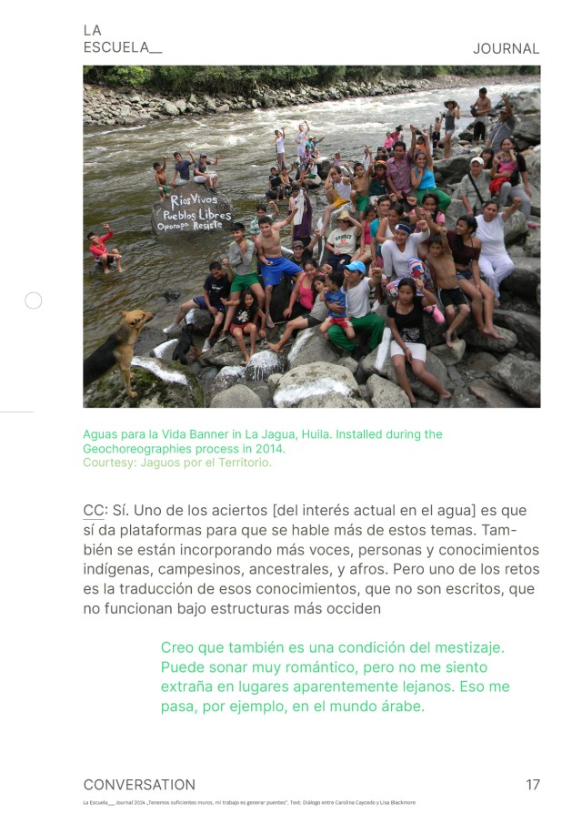
LA ESCUELA___ is an artist-run platform for radical learning and collective making in public spaces. We understand art as a form of knowledge production, and education as an artistic practice in itself. La Escuela seeks to bring learning and art to everyone by partnering with universities, institutions, and communities to create formative projects in public spaces throughout Latin America. La Escuela is rooted in a long genealogy of Latin American artists and educators who seek to bring education closer to real contexts, so as to learn and act on them. Through public learning, we propose a transdisciplinary program where diverse forms of practices coincide through the transformative capacity of education.
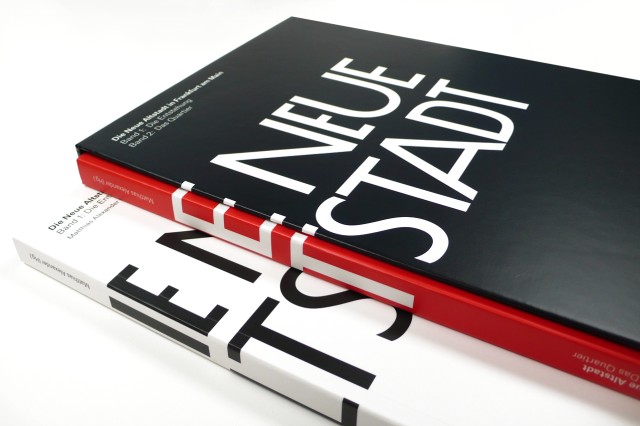
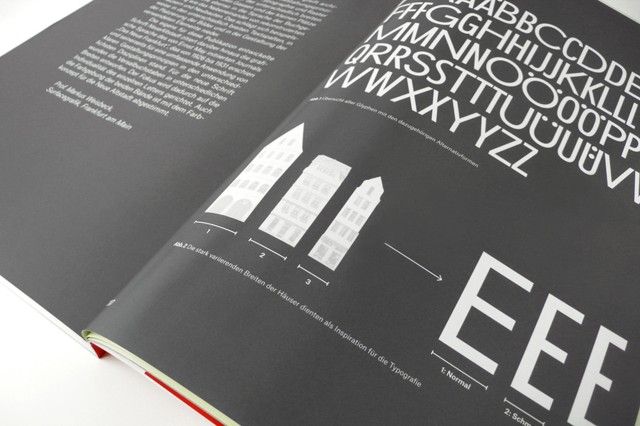
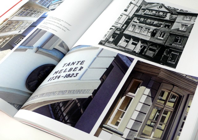
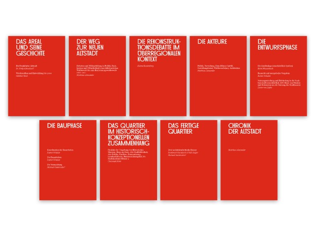
DIE NEUE ALTSTADT
Corporate Identity, Editorial Design
The graphic concept of this publication, has been conceived in relation to the architectural and urban design principles of the Neue Altstadt. Typography and the editorial design reflect the structure of houses of different widths, narrow streets and small squares into the language of book design, as well as the juxtaposition of reconstructed houses and new buildings. In addition, the Neue Altstadt typeface developed for this purpose, cites the graphic language of Ernst May’s Journal: “Das Neue Frankfurt” from 1926 to 1931.
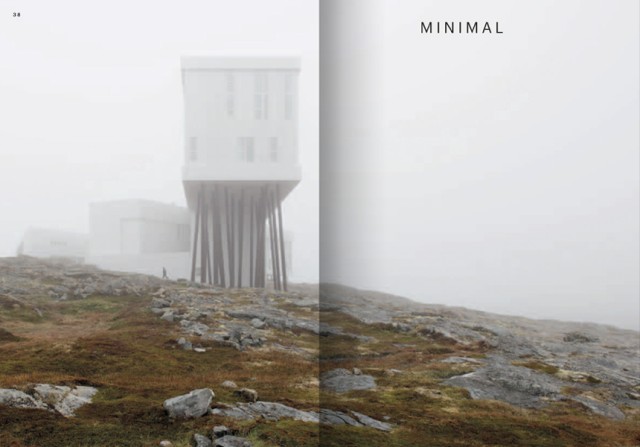
FOGO ISLAND ART
Corporate Design, Publication Series
The corporate design is based on the north-western view of Newfoundland’s Fogo Island. The exhibition room is part of the Fogo Island Inn, a project by The Shore Fast Foundation, and most of the works exhibited here are created throughout the course of the individual artist residencies. Fogo Arts
THIS DAY AND THAT WEEK
Timepoems
Due to a limitation of time measurement scales, typographic compositions are created that visualise this duration. The result is a graphic pirouette around the concept of time.
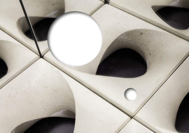
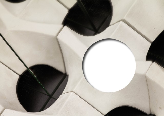
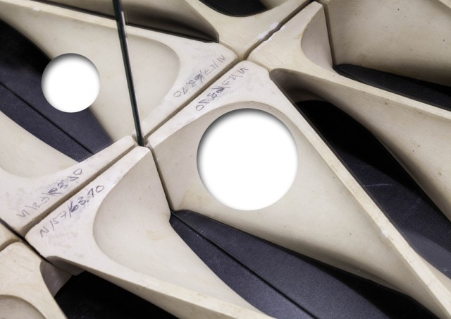
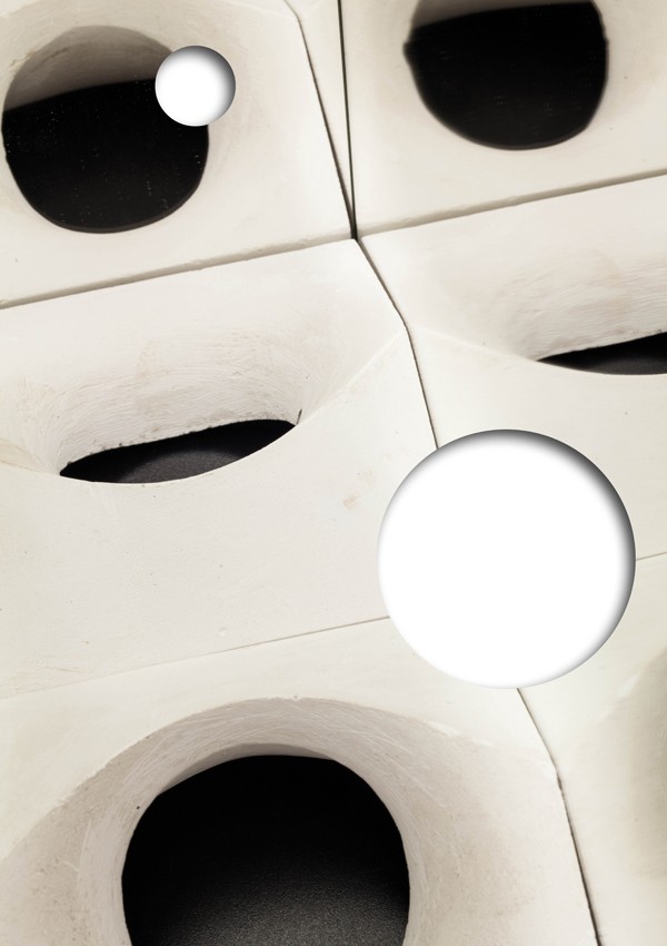
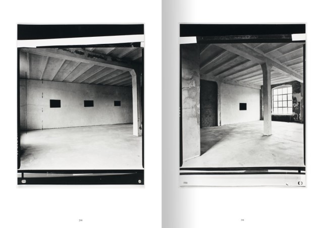
BAUPLASTIKEN
Research Project
Two models by Prof. Hubert Schiefelbein were staged in space in an endless mirror room and photographed in different perspectives. Afterwards circles were cut out of the photo originals. Through the mirror space the sculptures regain their original seriality. Universität Weimar
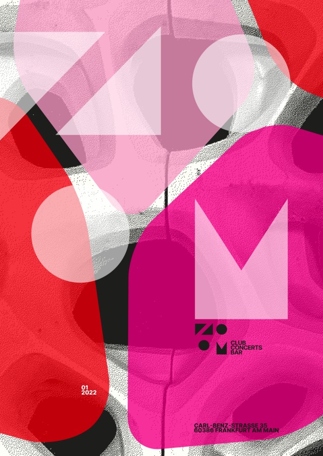
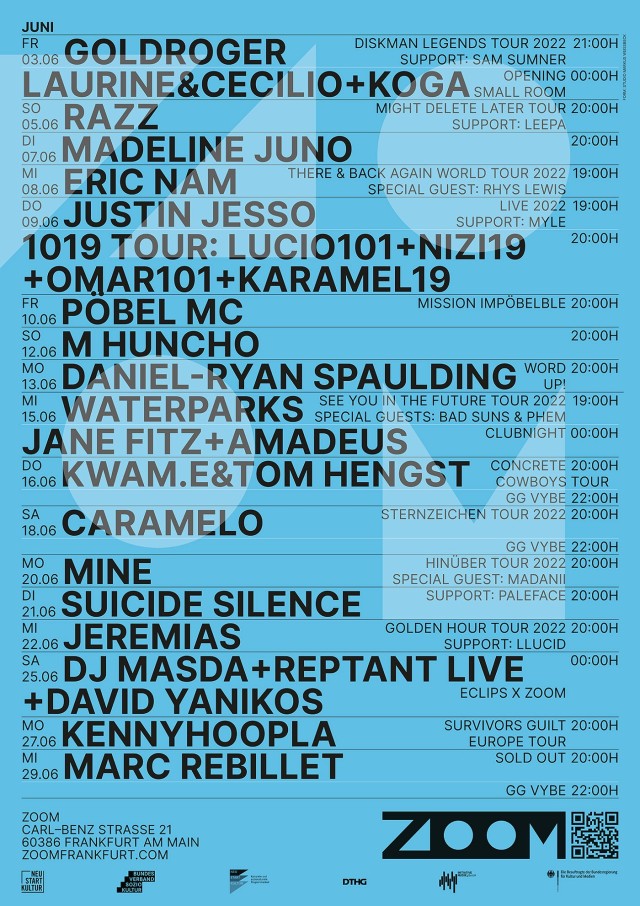
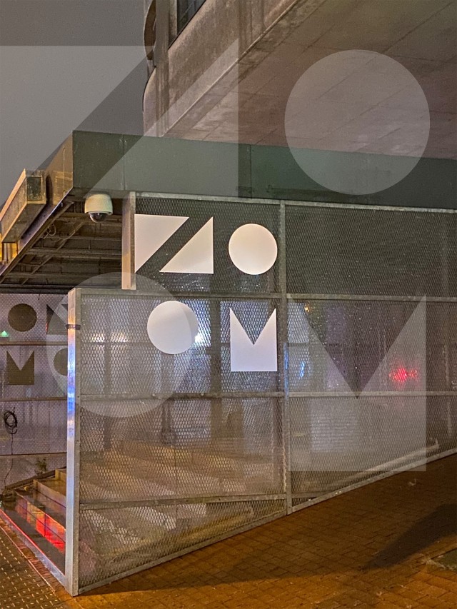
ZOOM CLUB
Corporate Identity
With a new location and a new identity opens with a new concept in Fechenheim. Equipped with the latest technical acoustics, standards are set here for live and club concerts. A separate bar area is used for smaller concerts and readings. The design is based on the graphic elements as variants of as many different arrangements as possible. The transparency accompanies the entire communication.
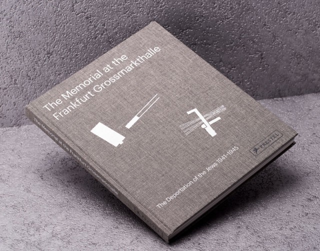
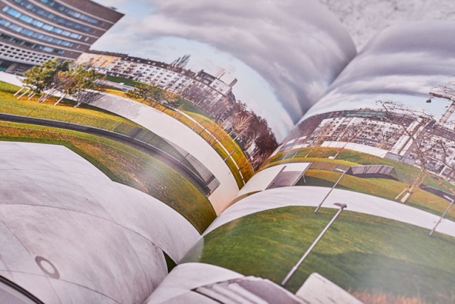
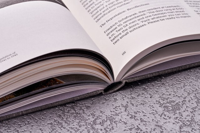
EUROPEAN CENTRAL BANK
Editorial Design
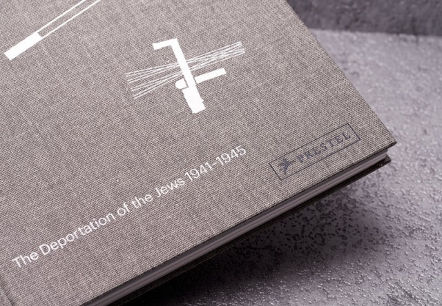
Publication for the Memorial on the Site of the former Grossmarkthalle.
The memorial represents a dark period in the history of the Grossmarkthalle. Between 1941 and 1945 more than 10,000 Jewish citizens were deported to concentration camps from here. Architects Tobias Katz and Marcus Kaiser won an international competition to design the memorial with their plans to include haunting descriptions of the deportations engraved throughout the site.
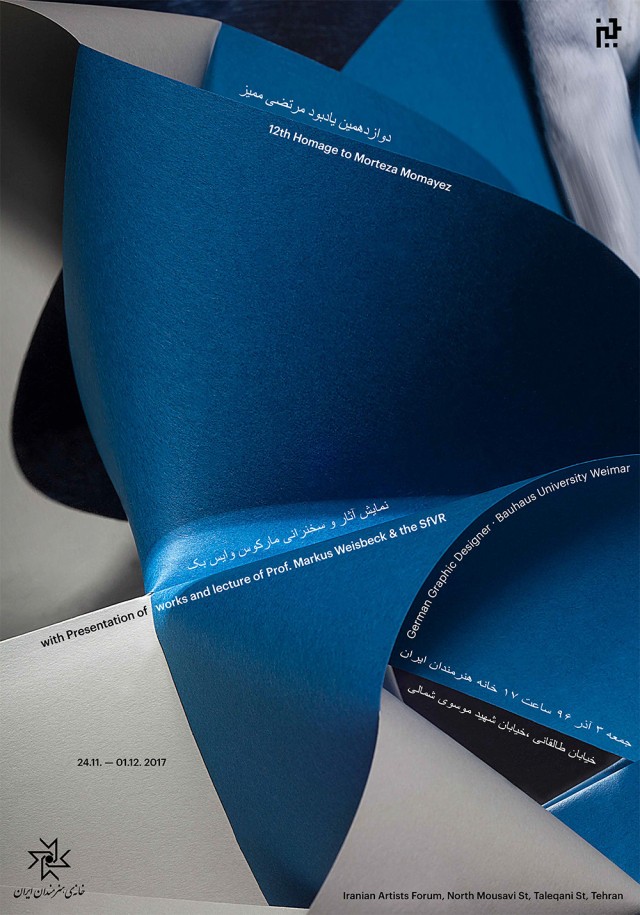
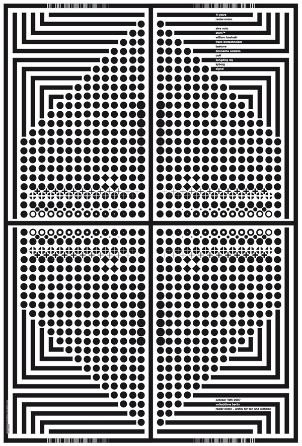
RASTER NOTON 11 YEARS, 12th HOMAGE TO MORTEZA MOMAYEZ
Poster
with Presentation of works and lecture of Prof. Markus Weisbeck & The Space for Visual Research (SfVR) German Graphic Designer, Bauhaus University Weimar 24. Nov. – 01. December 2017 Iranian Artists Forum, North Mousavi St, Taleqani St, Tehran Iranian Artists Forum
Anniversary Poster of the electronic music Label Raster Noton, Limited Edition Screenprint Poster, 100 x 140cm
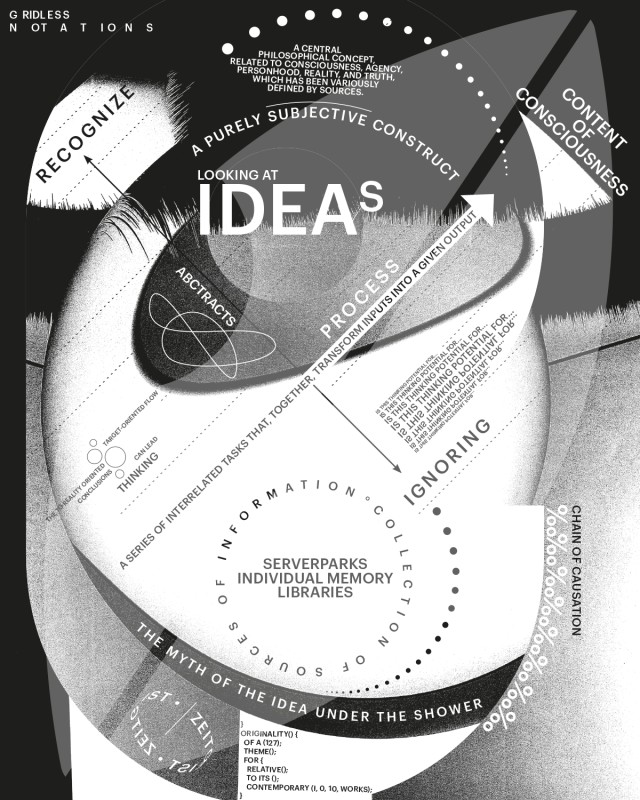
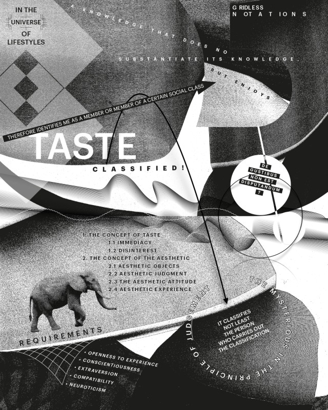
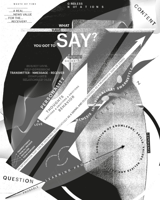
GRIDLESS NOTATIONS
Corporate Identity
Diagrams explain the important themes for designers: „looking at ideas“, „taste classified“ and „What you have to say“ as the basis of creative output.
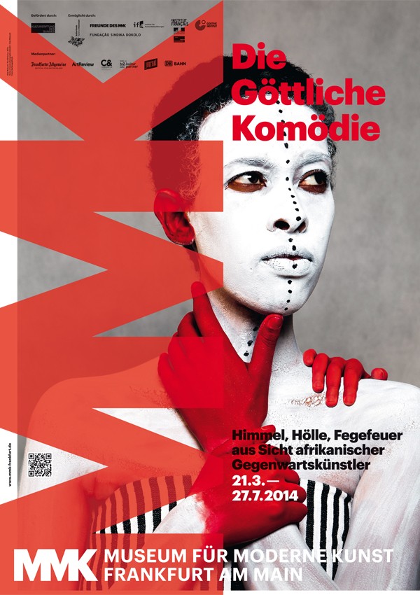
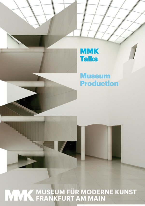
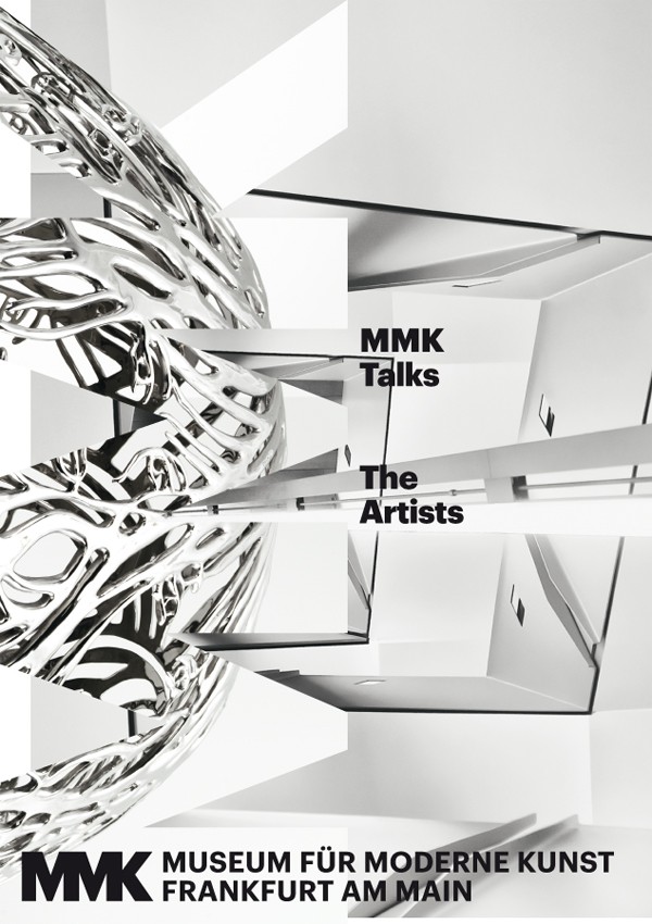
MUSEUM OF MODERN ART FRANKFURT
Corporate Identity, Corporate Design
The museum of modern art introduces its completely new graphic appearance by bringing the label as the brand for the institution on the same level as its content. The brand manifests itself using a monogram as a constant element thoroughout all products of visual communication. MMK Frankfurt
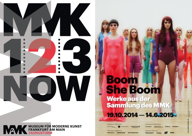
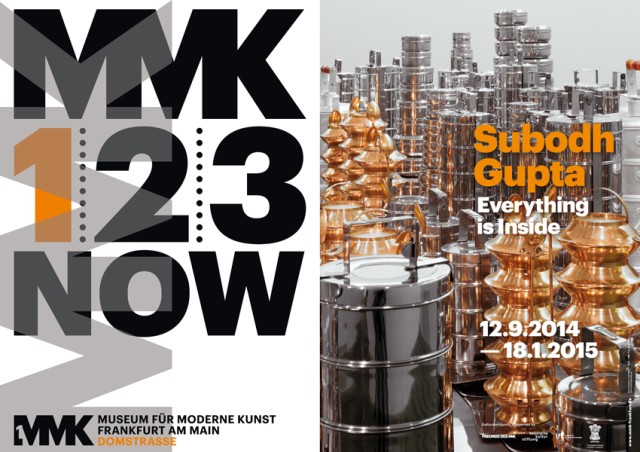
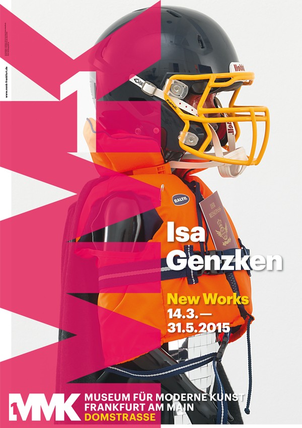
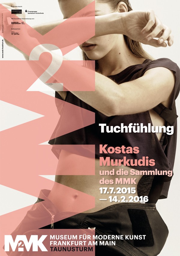
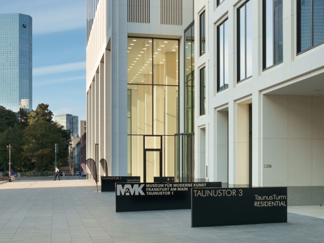
MUSEUM OF MODERN ART FRANKFURT 123 POSTERS
Corporate Design, Posters
The number system 1, 2 and 3 makes each house distinguishable from one another. Furthermore this typographic intervention serves for the rapid understanding of positioning and enables the logo to function as a way of navigating through the city. MMK Frankfurt
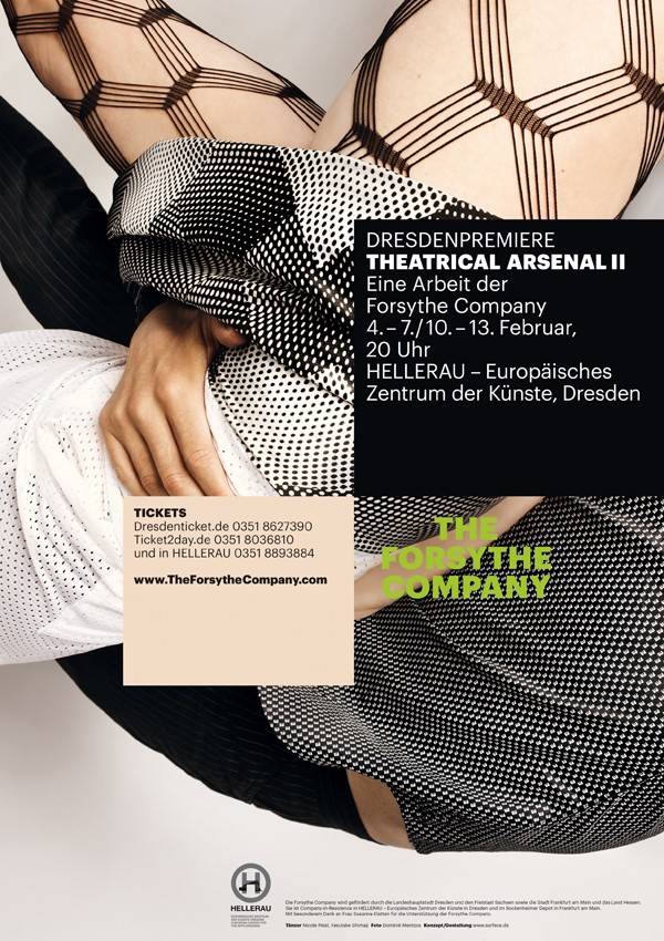
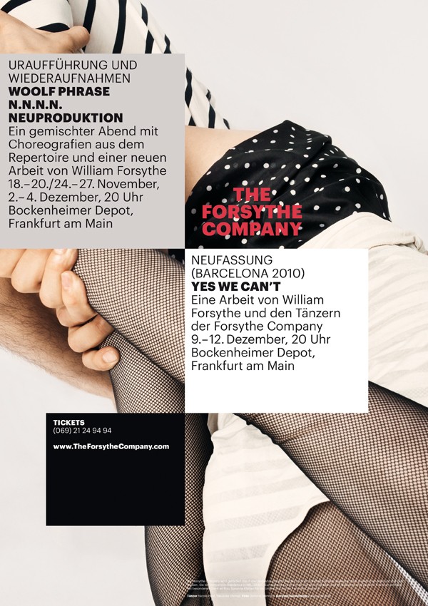
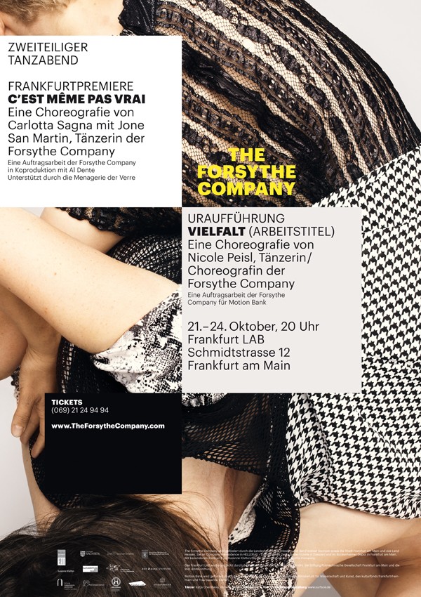
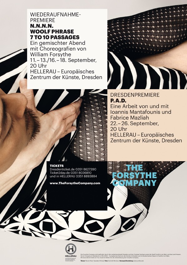
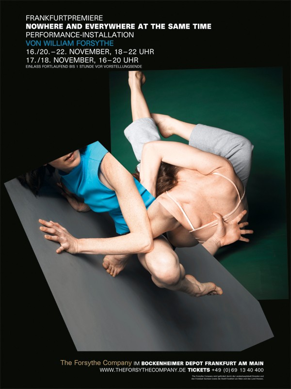
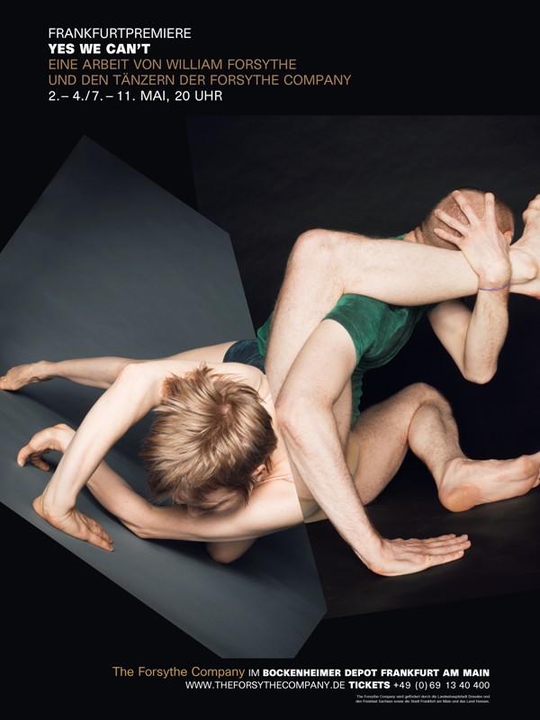
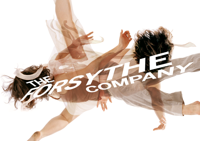
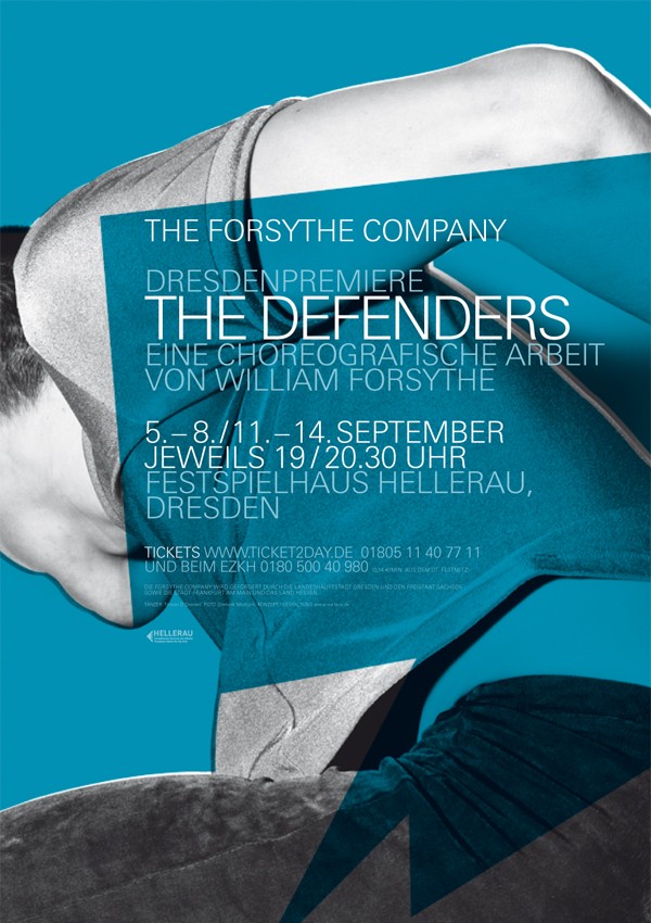
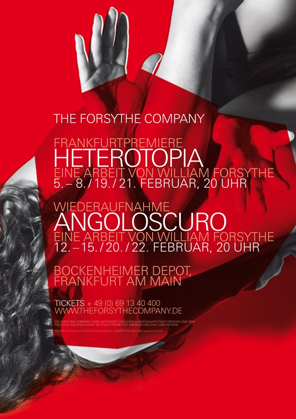
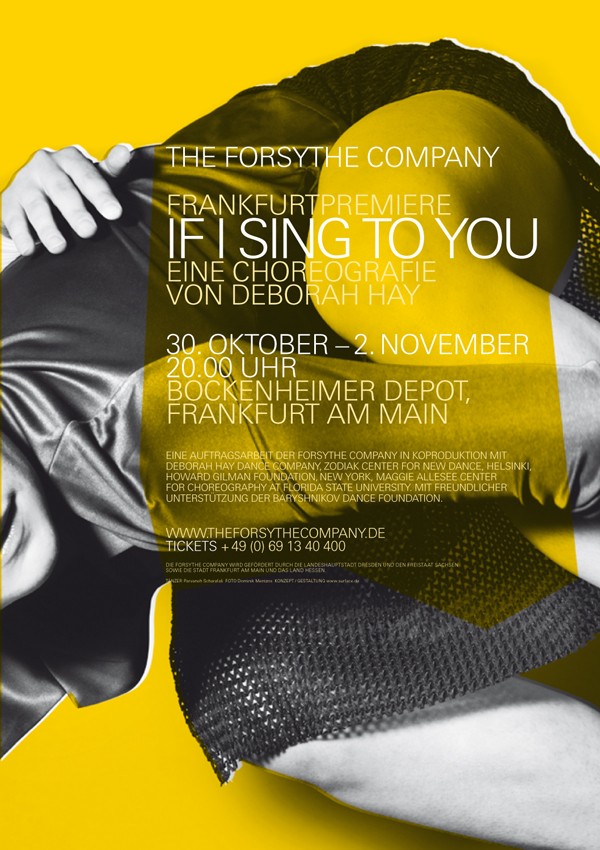
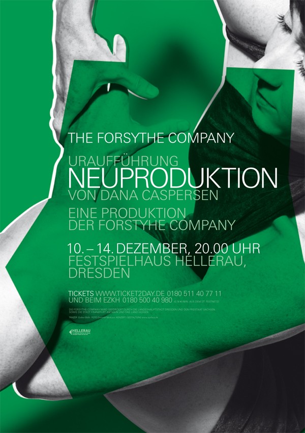
THE FORSYTHE COMPANY 2010/2011
Corporate Identity, Campaign
It was founded in 2005 as The Forsythe Company by American choreographer William Forsythe following the closure of the Frankfurt Ballet (German: Ballett Frankfurt), established in 1963. The ensemble further pursues the creative work carried out by Forsythe for 20 years with the Frankfurt Ballet, including producing works in the areas of performance, installation, film, and educational media, and drew most of its dancers from the prior company.
Structured textile surfaces describe in graphic form the repertoire of the new programme. Once again this series was conceived with William Forsythe and the photographer Dominik Mentzos.
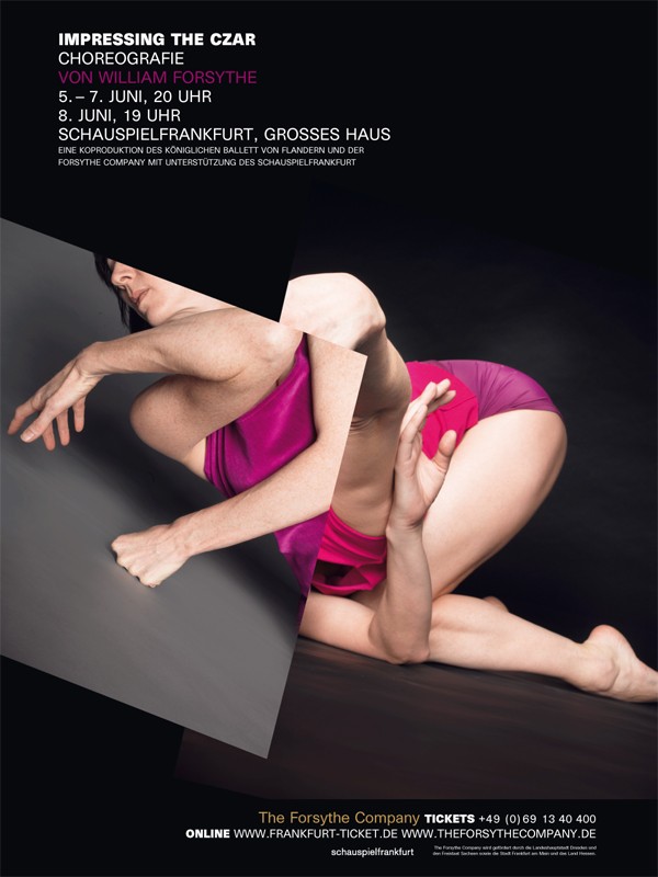
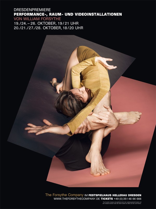
THE FORSYTHE COMPANY 2007/2008
Corporate Identity, Campaign
It was founded in 2005 as The Forsythe Company by American choreographer William Forsythe following the closure of the Frankfurt Ballet (German: Ballett Frankfurt), established in 1963. The ensemble further pursues the creative work carried out by Forsythe for 20 years with the Frankfurt Ballet, including producing works in the areas of performance, installation, film, and educational media, and drew most of its dancers from the prior company.
The dancers corpuses are defragmented into new abstract forms with intentional cuts and collages. The dynamic and procedural method corresponds to Forsythe’s choreography.
THE FORSYTHE COMPANY 2004/2005
Corporate Identity, Campaign
It was founded in 2005 as The Forsythe Company by American choreographer William Forsythe following the closure of the Frankfurt Ballet (German: Ballett Frankfurt), established in 1963. The ensemble further pursues the creative work carried out by Forsythe for 20 years with the Frankfurt Ballet, including producing works in the areas of performance, installation, film, and educational media, and drew most of its dancers from the prior company.
The 2004/2005 campaign for the Forsythe Company shows the dancers' exposed bodies, which are created by superimposing different movements as a composition. A further layer interweaves these with typographic wordmarks. Photography: Daniel Wöller
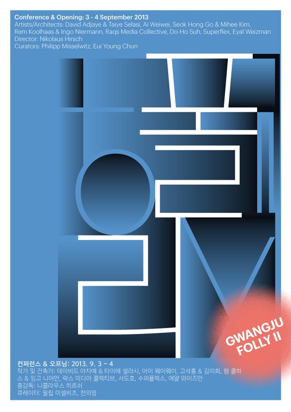
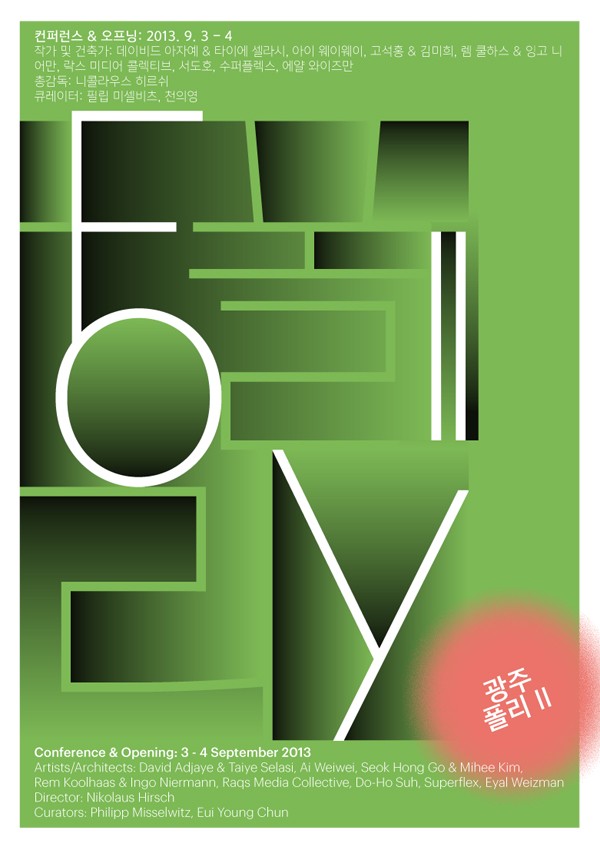
GWANGJU FOLLY II
Key visual, Publication, Brand
The key visual for the project by Gwangju Biennale Foundation, South Korea, references the Korean tradition of wooden windows. Within the visual the title “Folly II” is visible in both Korean and English. Gwangju Folly II will commission new works from the following architects, artists, collectives, and writers: David Adjaye & Taiye Selasi, Ai Weiwei, Seok Hong Go & Mihee Kim, Rem Koolhaas & Ingo Niermann, Raqs Media Collective, Do-Ho Suh, Superflex, Eyal Weizman.
Nikolaus Hirsch (director), Philipp Misselwitz and Eui Young Chun (curators) Gwangjufolly

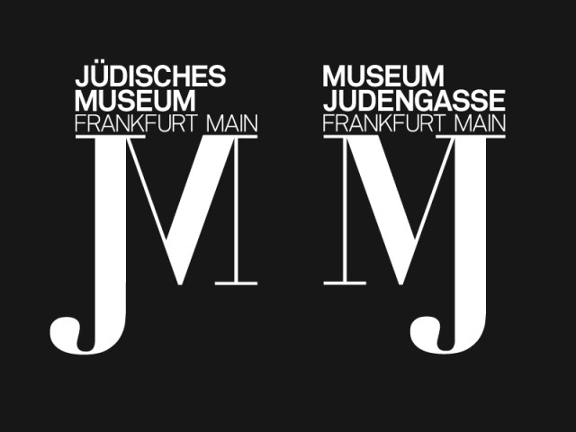
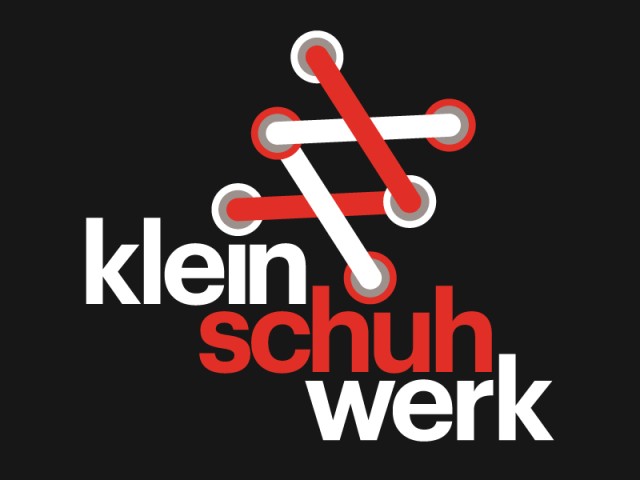
JÜDISCHE MUSEUM / MUSEUM JUDENGASSE, MELANCHOTONIA, ZUMTOBEL AG, KLEINSCHUHWERK
Identity
These examples of logo brands show different visual approaches of identity designs such as Jüdische Museum / Museum Judengasse, the Rotterdam Art Festival melanchotonia, the Zumtobel AG and Kleinschuhwerk the Mainz based Strore for children Shoes.
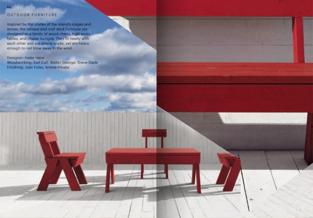
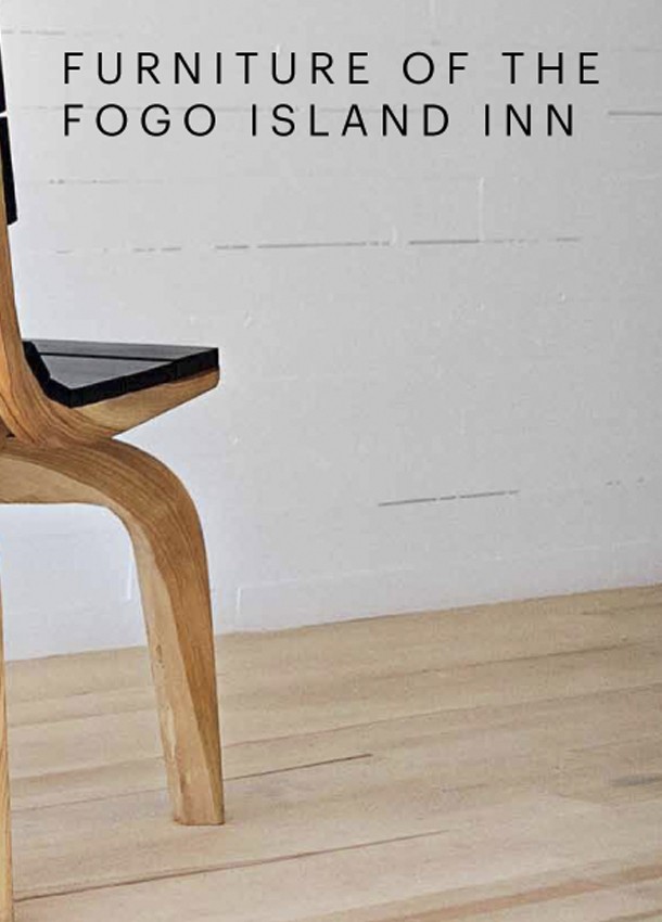
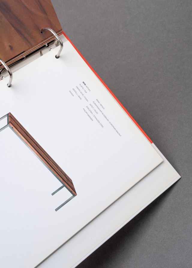
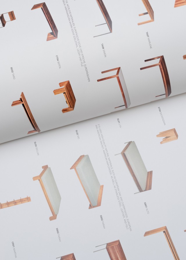
FURNITURE OF THE FOGO ISLAND INN
Catalogue, Editorial Design
Publication on the interior design of the hotel “Fogo Island Inn” following the series of exhibition catalogues from “Fogo Island Arts”.Fogo Furniture
GERMAN DESIGN AWARD 2014
The 2014 German Design Award featured a unique collaboration between Studio Markus Weisbeck and Oliver Hardt. This creative team utilized animations based on movements recorded at the Frankfurt Zoo to serve as the foundational element for the award show. These animations, capturing the essence of various animals' movements, were seamlessly integrated into the ceremony, enhancing the presentation of the winners' ideas and adding a dynamic visual component to the event. The use of such animations underscored the innovative spirit of the award, linking the natural world's elegance with cutting-edge design achievements.
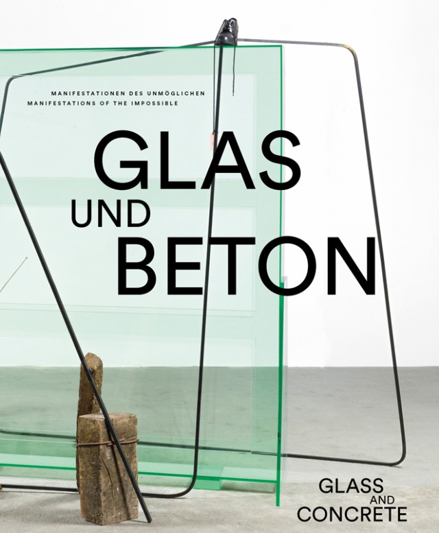
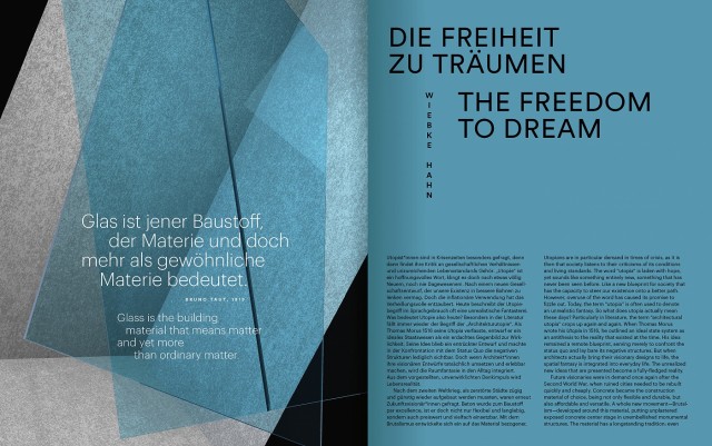
GLASS AND CONCRETE
Editorial Design
Despite their apparent differences, glass and concrete are connected by a long history. A Publication with the Artists Francis Alÿs, Peter Bialobrzeski, Oliver Boberg, Matti Braun, Andreas Bunte, Daniel Buren, Louisa Clement, Louis De Cordier, Alia Farid, Nina Fischer & Maroan el Sani, Thomas Florschuetz, Daniela Friebel, Vincent Ganivet, Jakub Geltner, Isa Genzken, Elín Hansdóttir, Mona Hatoum, Philipp Hennevogl, Stephan Huber, Thomas Huber, Aernoudt Jacobs, Jeffrey James, Isa Melsheimer, Jan Muche, Martin Mühlhoff & Christian Vossiek, Olaf Pernice, Túlio Pinto, Robin Rhode, Kilian Rüthemann, Kai Schiemenz, Wolfgang Schlegel, Adrien Tirtiaux, Tatiana Trouvé, Lena von Goedeke, Martin Walde (in cooperation with Bernd Weinmayer)
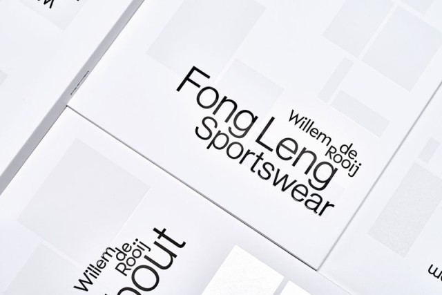
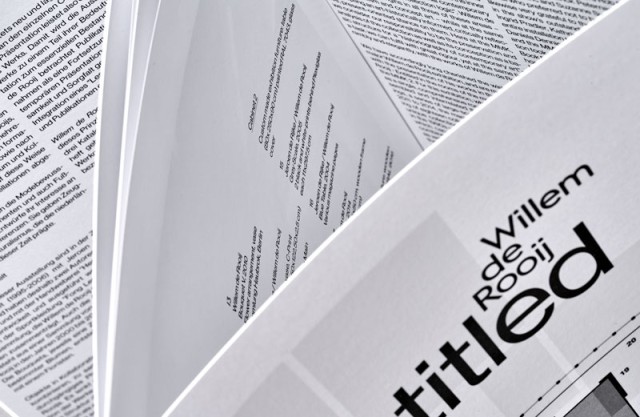
WILLEM DE ROOIJ
Editorial Design, Publication Series
In close collaboration with the artist we developed a series of exhibition catalogs for institutions in New York, Dijon and Frankfurt. The composition of the cover and also the selection of the fonts follow a fixed continual rule and change from edition to edition.
GRAVITATIONEN
Research Project
This work is concerned with the development and exploration of visual forms, taking the visual principles of academic-artistic teachings on modernism in the relevant schools, institutes and colleges of the 20th century as a base. The studies are less a reference to modernity, but their methodologies should rather be understood as a departure from pure image as an artistic expression, regardless of an academic art or applied art education. Sternberg Press
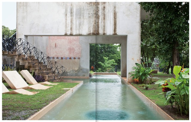
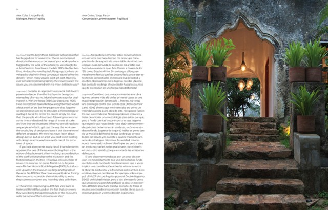
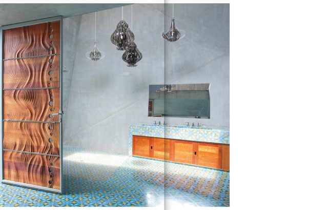
JORGE PARDO, TECOH
Editorial Design
Tecoh is a sprawling series of buildings designed by the artist Jorge Pardo deep in the Yucatán jungle. Taking over six years to fabricate, and engaging existing ruins of a nineteenth-century hacienda, the project is by far the artist’s most ambitious work to date. This book offers the only available glimpse of the project, as it was primarily conceived as a private residence. Over 100 color images choreograph the reader around the myriad buildings and landscaping that constitute Tecoh—from subterranean concrete forms peaking out of the wild jungle grasses to quiet details of tiles and furniture to Pardo’s iconic bulbous lamps. Edited by ALEX COLES, 2012
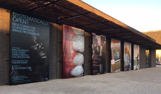
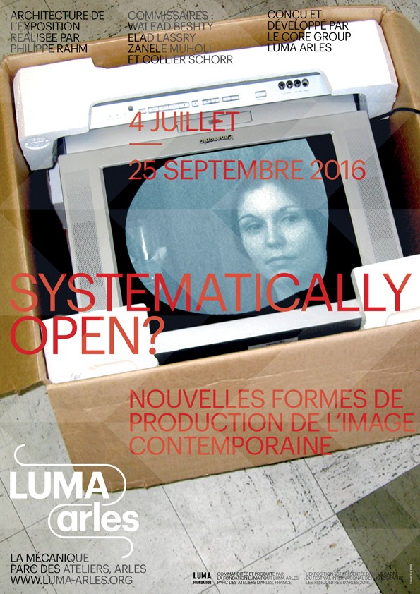
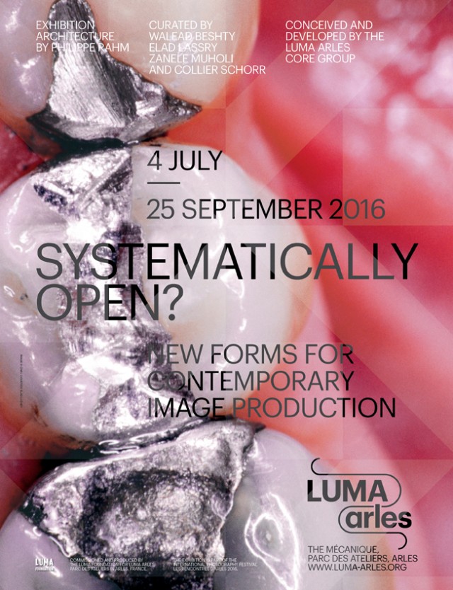
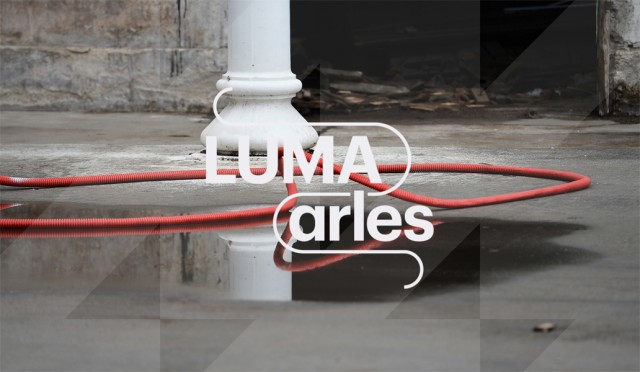
LUMA ARLES
Corporate Identity
LUMA Arles is a new experimental contemporary art center that brings together artists, researchers, and creators from every field to collaborate on multi-disciplinary works and exhibitions. An artistic program developed in collaboration with LUMA Arles core group of artistic consultants – Tom Eccles, Liam Gillick, Hans Ulrich Obrist, Philippe Parreno, and Beatrix Ruf – is presented periodically in the already inaugurated venues of La Grande Halle, Les Forges and La Mécanique générale.LUMA Arles
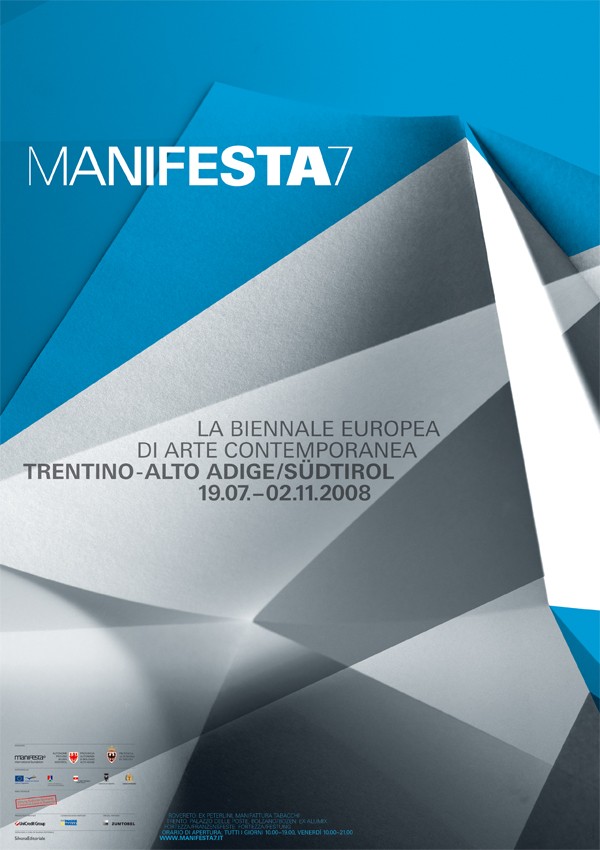
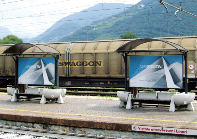
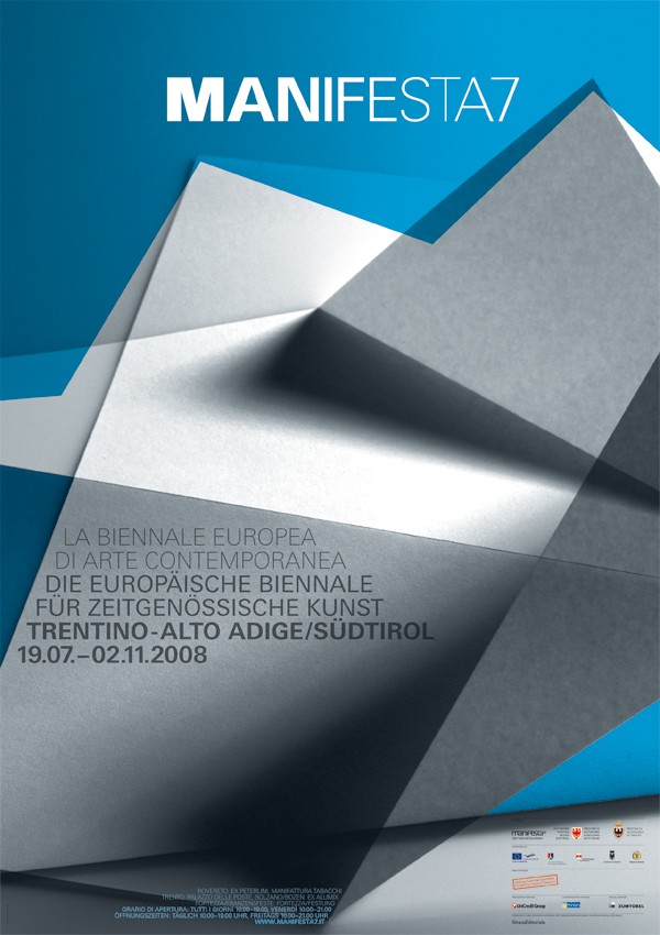
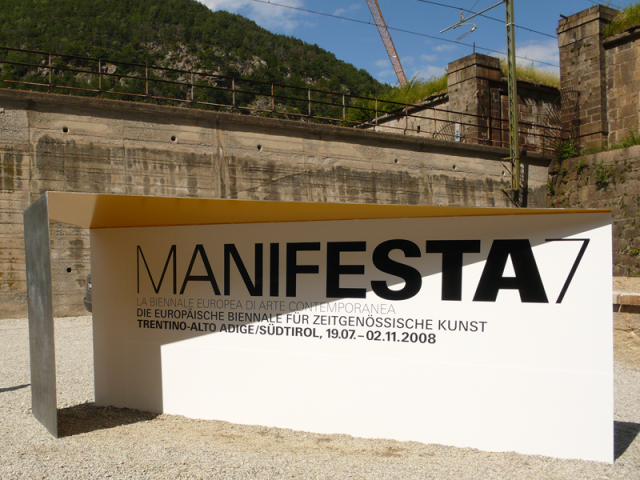
MANIFESTA7 LA BIENNALE EUROPA
Corporate Identity
The idea for the key visuals of Manifesta7 changes abstractly between a bricolage and a tourist-alpine picture that is further underlined by color selection.
The theme of the animated wordmark with its possible variations describes the movement of the connecting waters between Franzensfeste and Roverto.
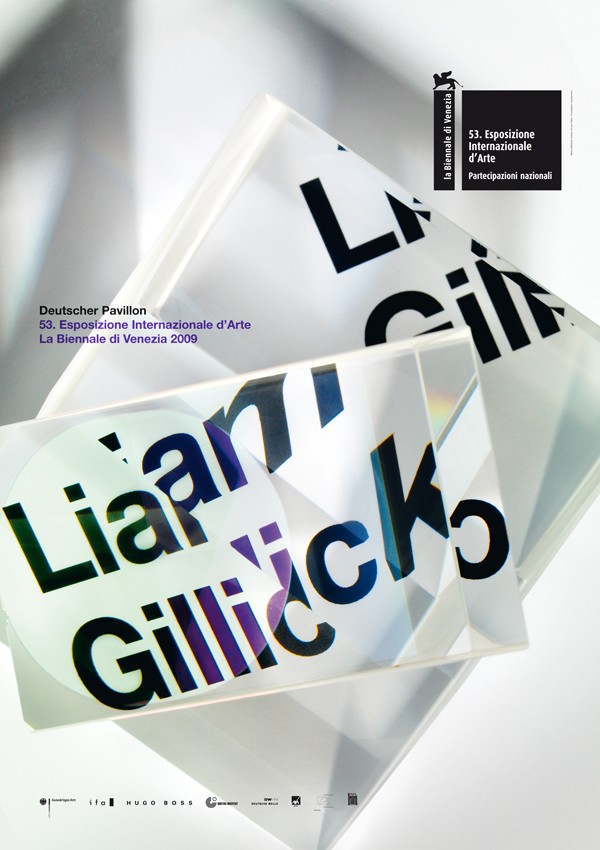
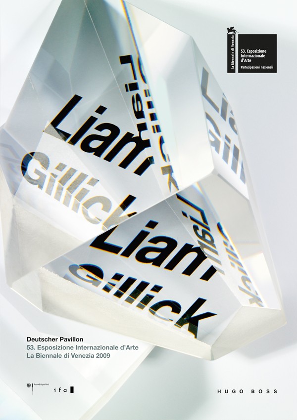
LIAM GILLICK, BIENNALE DI VENEZIA 2009
Corporate Campaign
The campaign for the German Pavilion of the 53. Venice Biennale is based on the idea to display the artist’s name in several orthographical variations. Different refractions through a prims create the key visuals for the poster, invitations and website. Photography by Jörg Baumann.
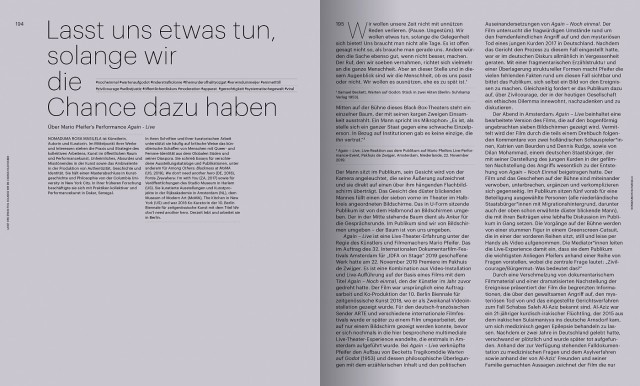
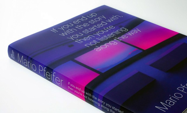
MARIO PFEIFER
Editorial Design
The new monograph on Mario Pfeifer’s work in film and video. This bilingual (DE/EN) and internationally distributed publication follows Pfeifer‘s first comprehensive solo exhibition in Canada / North America at The Power Plant, Toronto.The Power Plant The exhibition was curated by Director Gaëtane Verna with the assistance of Nabila Abdel Nabi. The publication includes essays by Georg Imdahl on the artist’s socio-political investigations and Nomaduma Rosa Masilela on Pfeifer’s first live performance work. A conversation between Pfeifer and Canadian artist Stan Douglas weaves through the historical and contemporary issues of image production, music, pop culture and politics of the now.
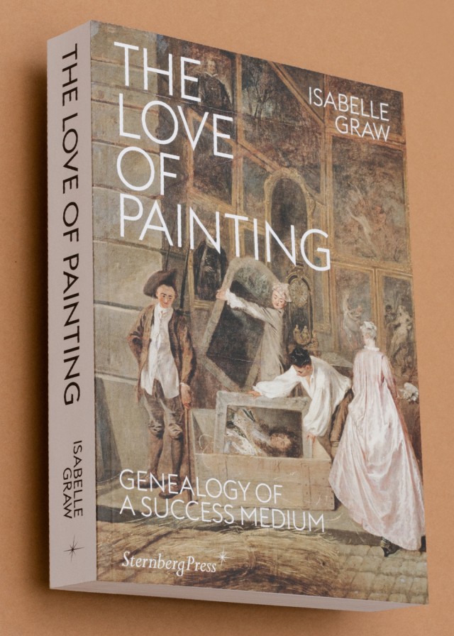
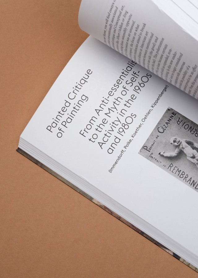
THE LOVE OF PAINTING
Editorial Design
Following the tradition of classical theories of painting based on exchanges with artists, Isabelle Graw’s The Love of Painting considers the art form not as something fixed, but as a visual and discursive material formation with the potential to fascinate owing to its ability to produce the fantasy of liveliness.
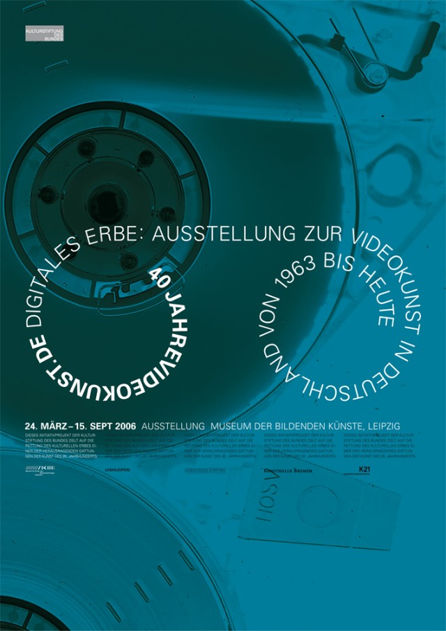
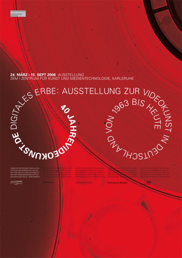
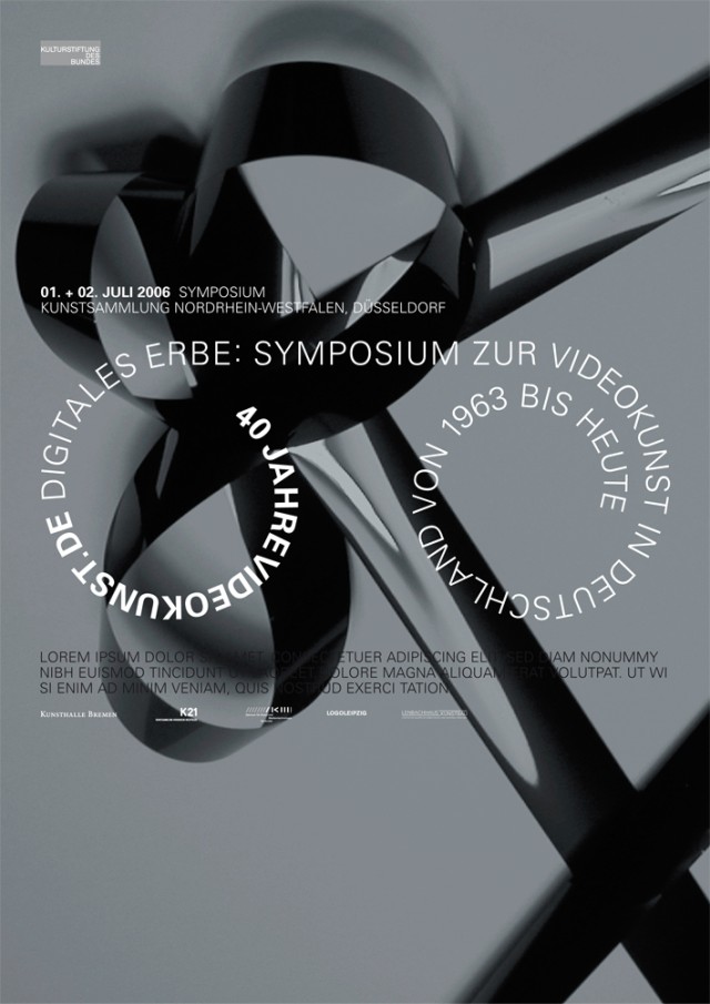
MUSEUM DER BILDENDEN KÜNSTE, LEIPZIG, 40 JAHRE VIDEOKUNST
Editorial Design, Poster
A panorama of video art produced in Germany with more than 28 hours of historic as well as current works by 59 artists, distributed as a box of 12 DVD. The DVD study edition aims at furthering the perception and discussion of video art in academies, universities, schools etc. Due to copyright restrictions, the set can only be ordered by institutions from the fields of research and education for internal viewing. Any other use like public presentation, lending or selling is strictly prohibited. 2006
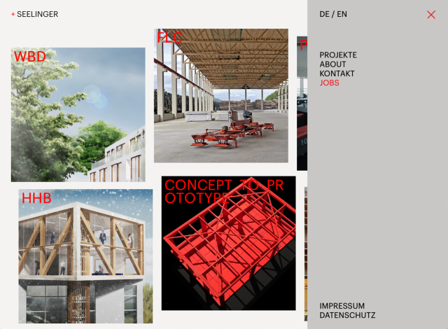
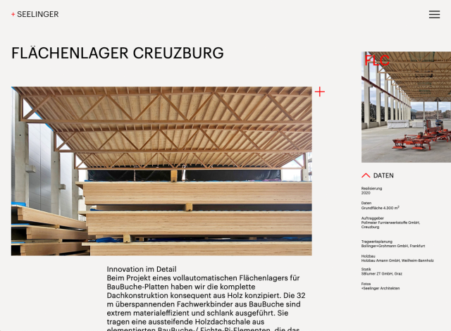
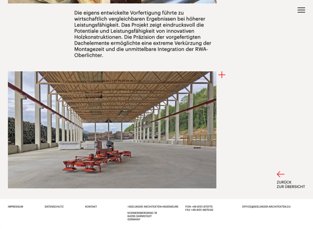
+SEELINGER ARCHITEKTEN
Corporate Identity
+Seelinger Architekten+Ingenieure +Seelinger Architekten+Ingenieure is an international networked planning team for architecture, urban planning and design. Their portfolio of concepts and buildings constructed includes urban planning, residential buildings, educational and cultural buildings, office buildings, traffic, infrastructure and health buildings as well as logistics and production buildings.
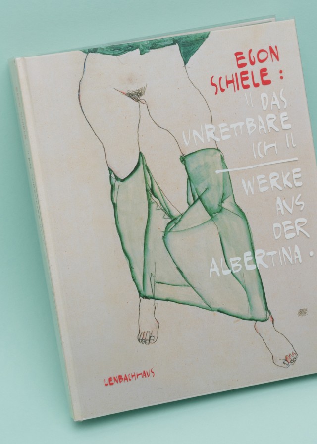

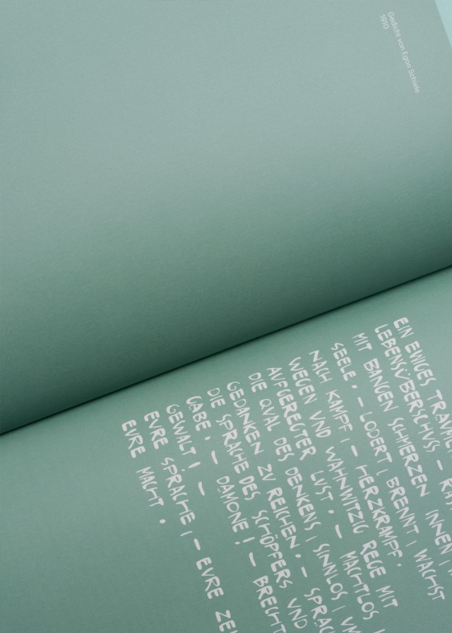
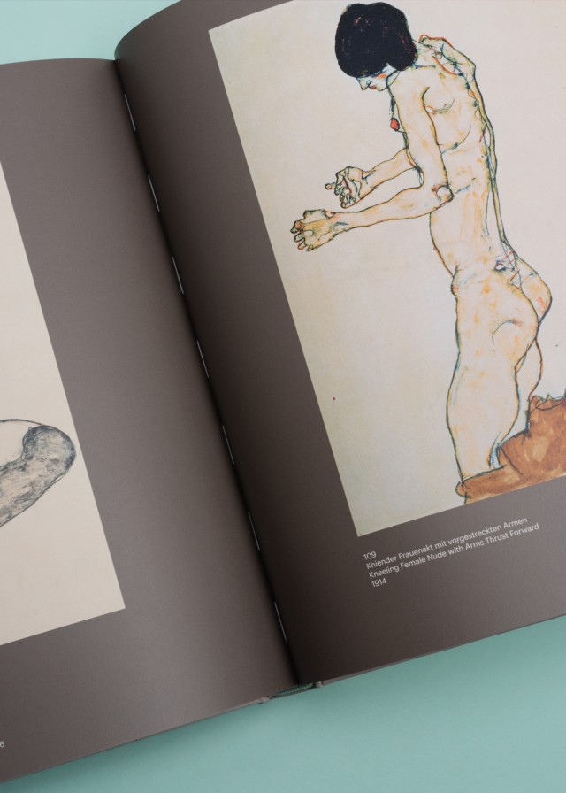
EGON SCHIELE
Editorial Design
This publication thus focuses on crucial aspects of Schiele’s intellectual world, going beyond grouping his works by their motifs alone. It addresses questions of identity, Schiele‘s understanding of his role as a artist, and his thoughts on processes of perception, in which the influence of Japanese coloured woodcuts – hitherto unresearched – played a key role. An individual typeface was designed especially for this purpose.
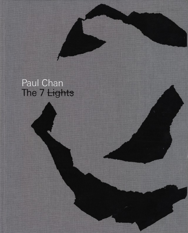
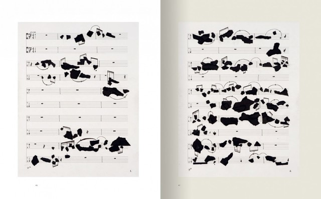
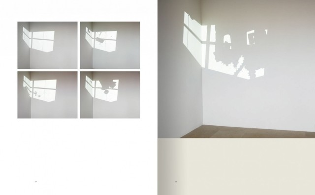
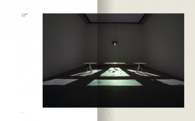
PAUL CHAN
Editorial Design
The American artist Paul Chan has gained international acclaim for his video work, drawings and installations that blend a novel drafting aesthetic with philosophical reflections on politics, religion, sex and life. This beautifully produced monograph, published on the occasion of Chan’s highly anticipated one-person exhibition at New York’s recently unveiled New Museum of Contemporary Art, presents the first significant overview of his work. Spanning from the late 1990s through today, it is named for Chan’s most recent project, The 7 Lights (2005–07), a series of large-scale digital projections and drawings that “hallucinate” the Seven Days of Creation.
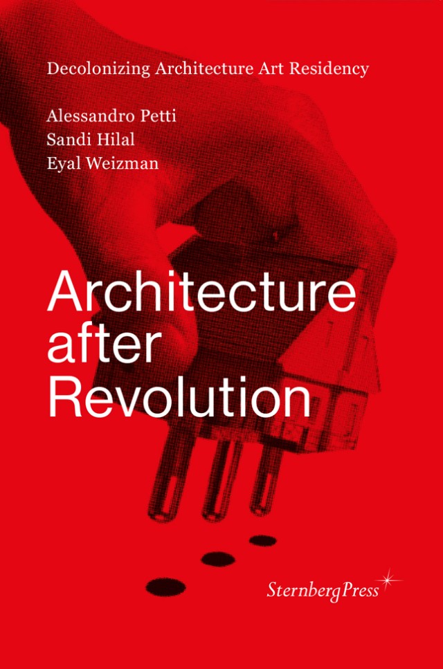
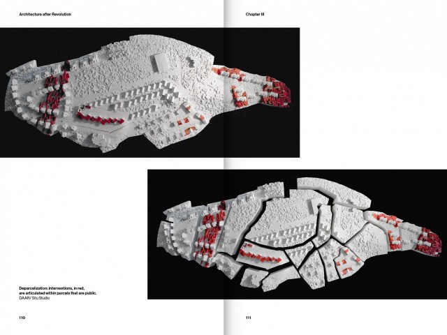
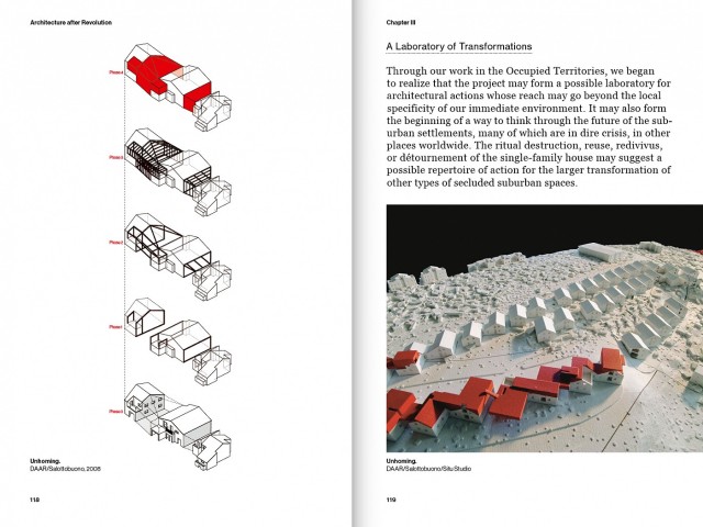
ARCHITECTURE AFTER REVOLUTION
Editorial Design
Sandi Hilal, Alessandro Petti, Eyal Weizman
The work presented in this 2013 published book is an invitation to undertake an urgent architectural and political thought experiment: to rethink today’s struggles for justice and equality not only from the historical perspective of revolution, but also from that of a continued struggle for decolonization.
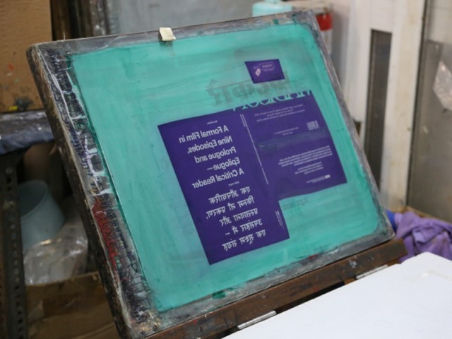
A CRITICAL READER
Editorial Design
In the form of a critical reader, Mario Pfeifer and Markus Weisbeck designed an artist’s publication which considers Pfeifer’s multiple screen, high definition video installation “A Formal Film” (2010) through essays and conversations from India and Europe. Furthermore the publication is a collection of printing techniques and paper stocks that are still available and specific to Mumbai. The publication also includes graphic illustrations, known as ‘Taxi Sticker Art’ as well as a ready-made bookmark. Spector Books
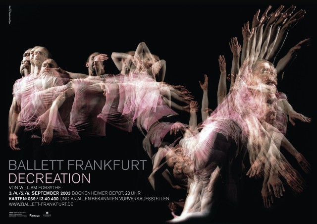
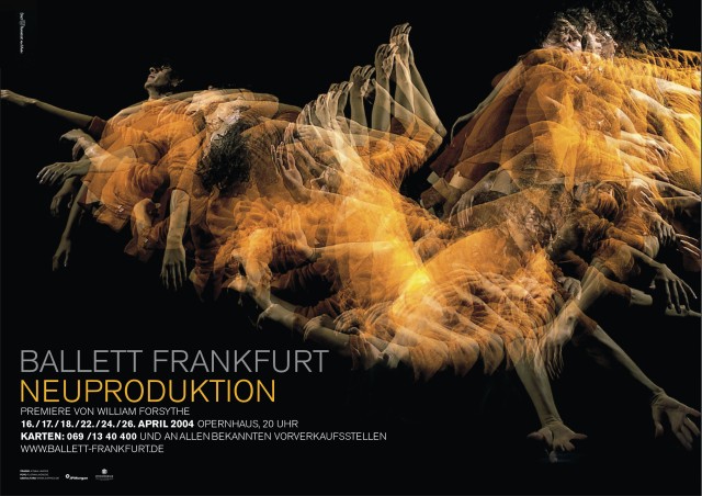
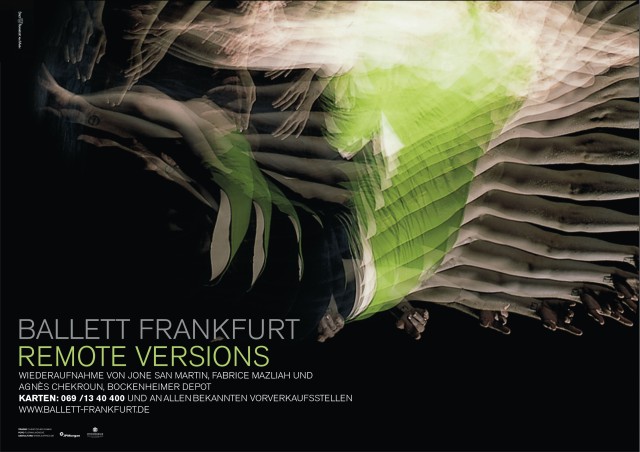
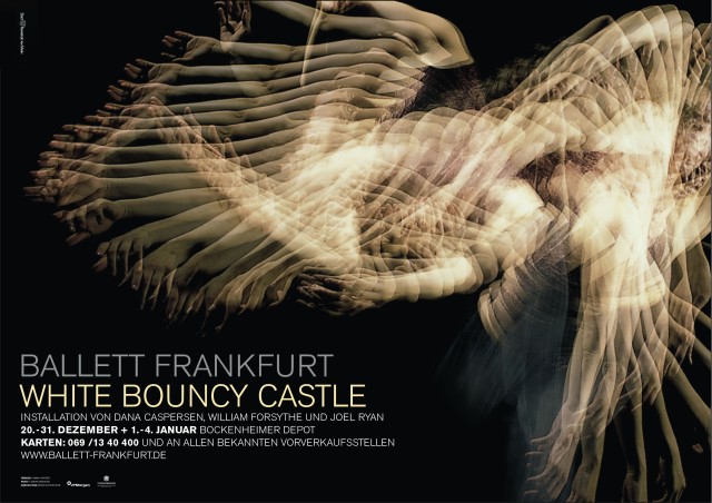
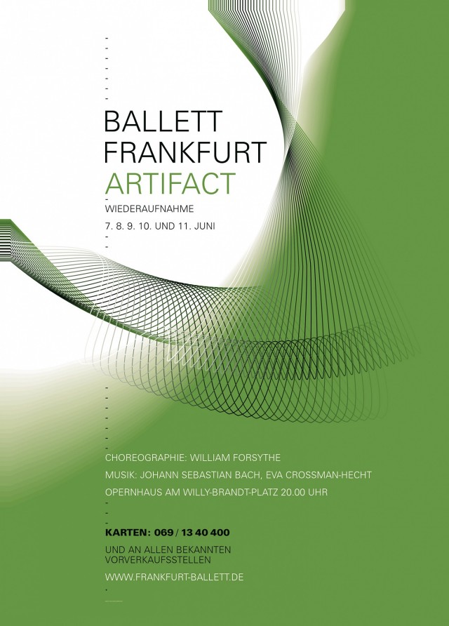
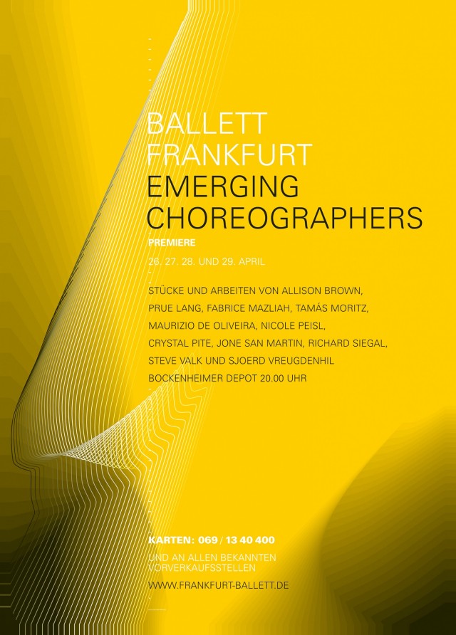
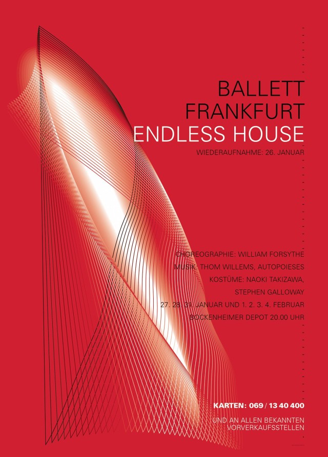
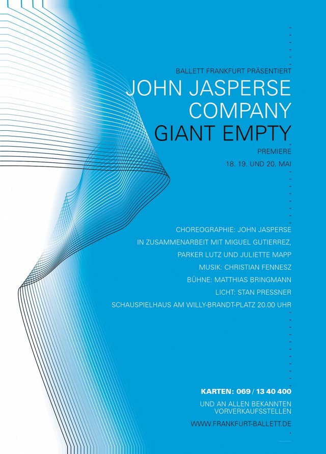
BALLETT FRANKFURT
Corporate Identity, Campaign 2003/2004
With stroboscopic photography it is possible, for example, to combine the individual phases of a rapid movement in a single shot. Specific movements of the company’s repertoire create the different forms for the posters.
BALLETT FRANKFURT 2003
Corporate Identity, Campaign
With stroboscopic photography it is possible, for example, to combine the individual phases of a rapid movement in a single shot. Specific movements of the company’s repertoire create the different forms for the posters.
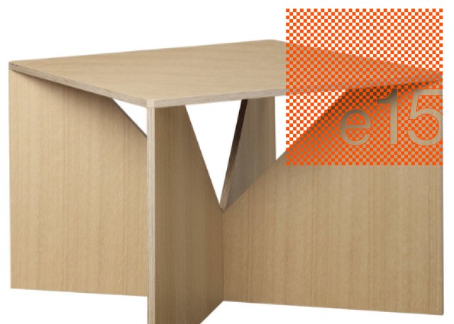
E15
Corporate Identity
Developing a corporate design with a visual language for the renowned e15 brand. The design is synchronised with the product language and has a reduced appearance.
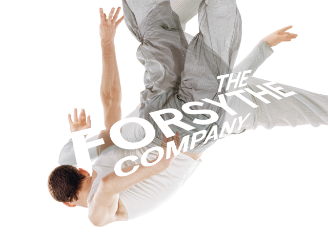
THE FORSYTHE COMPANY 2011/2012
Corporate Identity, Campaign
It was founded in 2005 as The Forsythe Company by American choreographer William Forsythe following the closure of the Frankfurt Ballet (German: Ballett Frankfurt), established in 1963. The ensemble further pursues the creative work carried out by Forsythe for 20 years with the Frankfurt Ballet, including producing works in the areas of performance, installation, film, and educational media, and drew most of its dancers from the prior company.
This ballet campaign features bold typography headlines paired with rehearsal photos of a single dancers. The idea is to marry photographic elements and pure graphic design to create a unified key visual. Photos by Dominik Mentzos
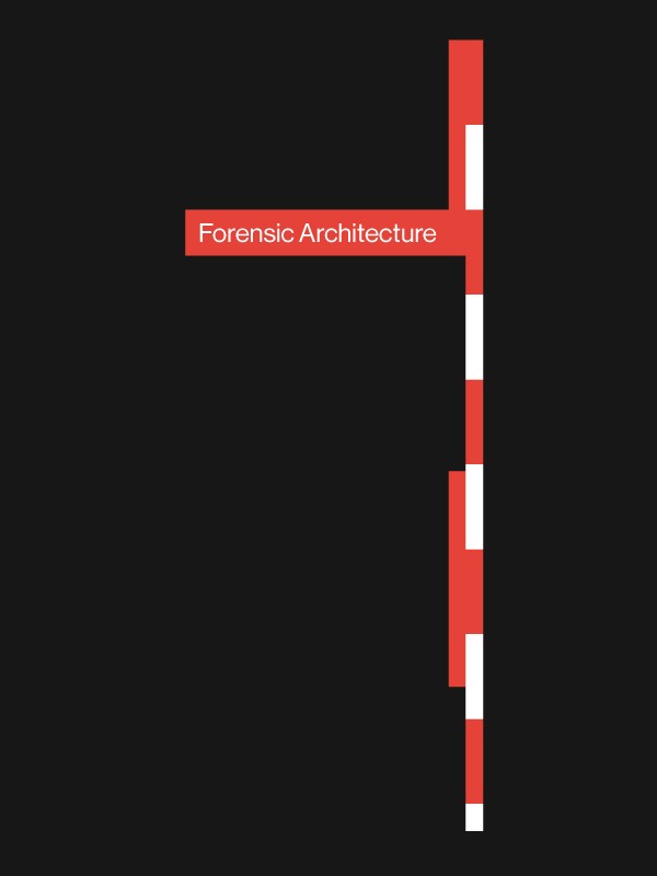
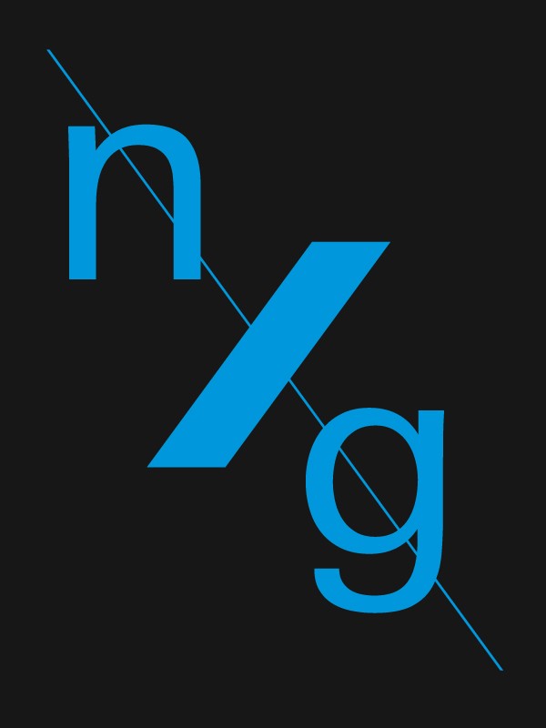
SIGNATURE FILMS, HISTORISCHES MUSEUM FRANKFURT, FORENSIC ARCHITECTURE, nXg
Identity
As a rule we always promote the meaning of the institution – every graphical composing is readable as a translated visual. This translation as process is the team-result of research and conversation of the client with the designer.
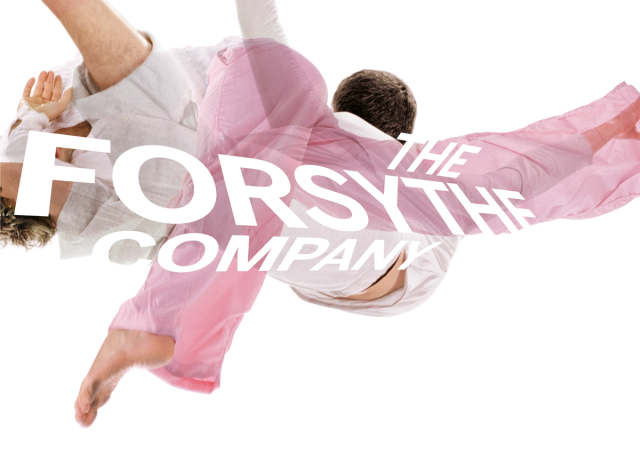
THE FORSYTHE COMPANY 2008/2009
Corporate Identity, Campaign
It was founded in 2005 as The Forsythe Company by American choreographer William Forsythe following the closure of the Frankfurt Ballet (German: Ballett Frankfurt), established in 1963. The ensemble further pursues the creative work carried out by Forsythe for 20 years with the Frankfurt Ballet, including producing works in the areas of performance, installation, film, and educational media, and drew most of its dancers from the prior company.
The 2008/2009 campaign for the Forsythe Company displays black + white photography with abstract spaces that, due to their transference, emphasize the dynamics of the figure. The graphic composition integrates the typography in the areas with color and photography.
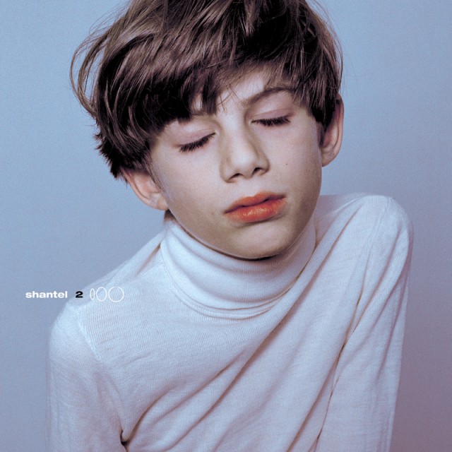
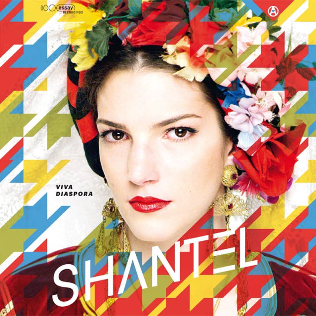


SHANTEL
Cover Design
Since 1997 Studio Markus Weisbeck creates the art work for Shantel, including covers, posters etc., very often in collaboration with internationally renowned photographers as Studio Harcourt Paris for example.
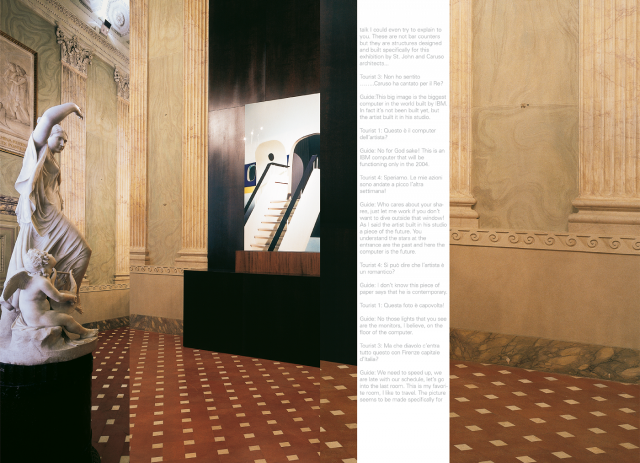
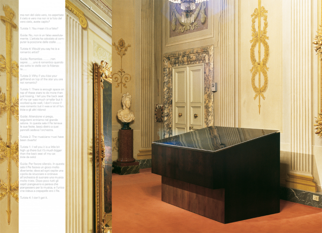
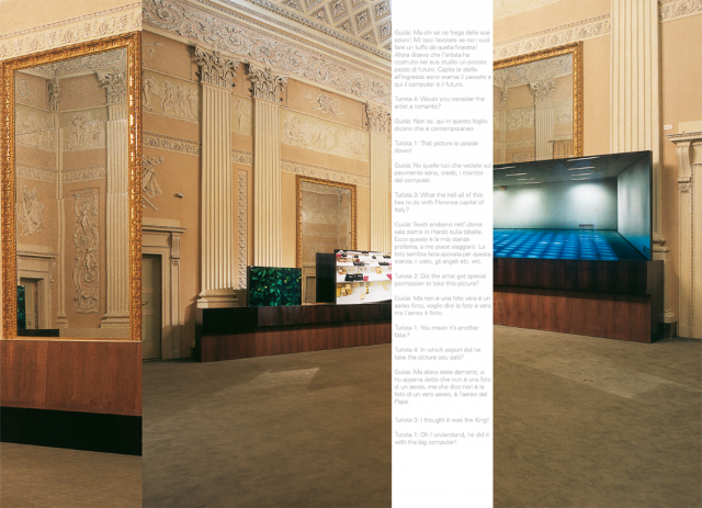
THOMAS DEMAND CON CARUSO ST. JOHN ARCHITETTI A PALAZZO PITTI
Editorial Design, Publication
The German artist Thomas Demand presented in Florence six photographic works instating a dialogue with that extraordinary context that is Palazzo Pitti, three works have been made especially for this context. The Publication references on the proportions of the graphical tools. Curated by Francesco Bonami and Photography by Nic Tenwiggenhorn.
WHATNESS
Label, Cover Design
Whatness is an audio gallery founded in 2000 with the aim of combining structures of the visual and musical arts. Internationally renowned artists present their own works as entirely autonomous artistic positions. The fusion of these positions in a project specially created for Whatness generates an expansion of the original media and explores the possibilities of an exchange between art and music by various means such as graphic notation, instrument making and vocal art. The respective collaborations are then published as a CD. Whatness
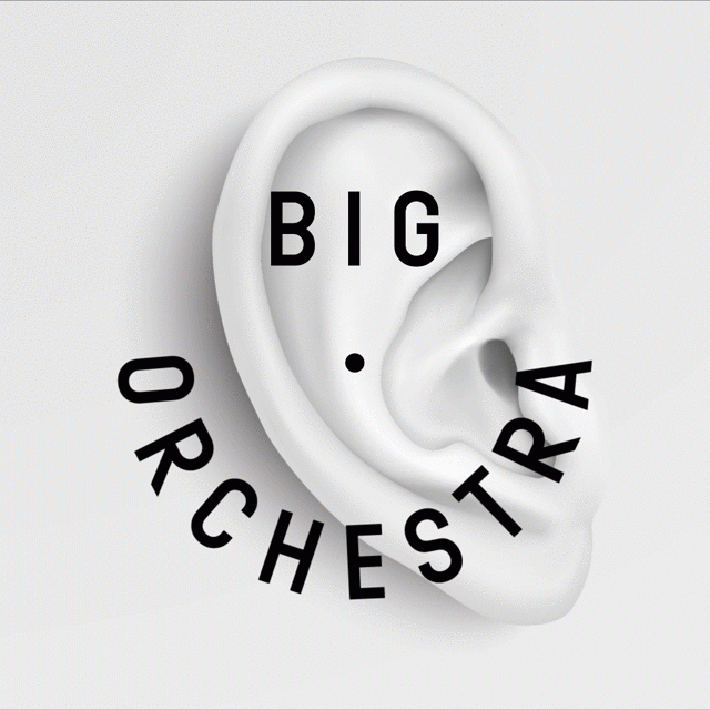
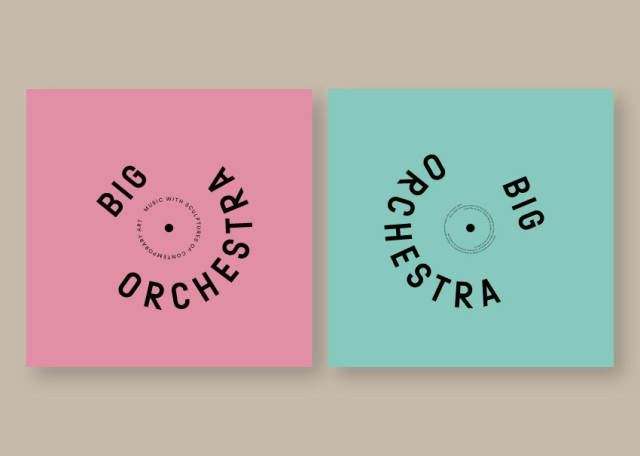
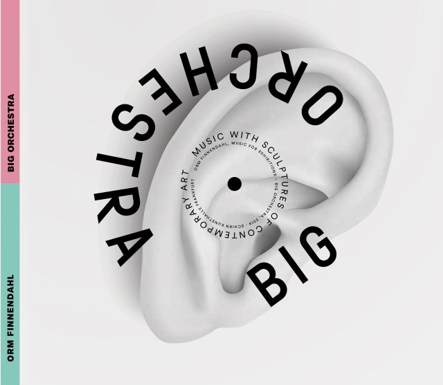
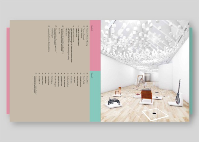
BIG ORCHESTRA
Corporate Identity
In this group exhibition featuring international artists the SCHIRN presents pieces that also function as musical instruments. The focus of the exhibition, which is itself in a state of constant flux, is the playing of these sculptural instruments. The design themed on rotation and loops focusing one aspect of recorded music.
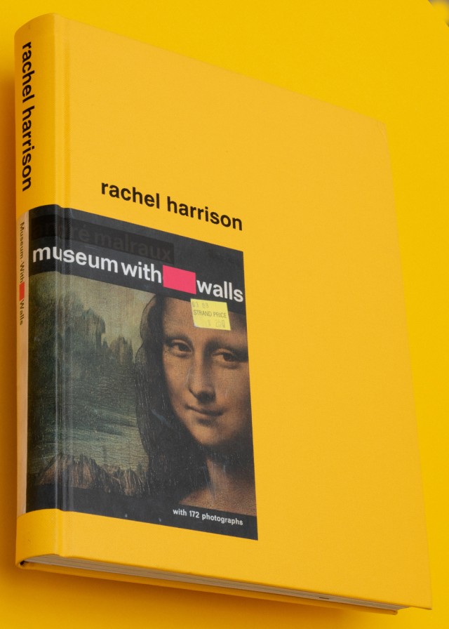
RACHEL HARRISON, MUSEUM WITH WALLS
Editorial Design
Rachel Harrison is one of the most exciting artists making sculptures today. This volume, the most comprehensive monograph of Harrison’s sculpture, video and painting to date, provides documentation of the past 15 years of her work and includes essays by Tom Eccles, David Joselit, Iwona Blazwick and Jack Bankowsky, plus contributions from Paul Chan, John Kelsey, Allan McCollum, Lucy Raven, Amy Sillman and Steven Stern.Museum With Walls
Rachel Harrison is one of the most exciting artists making sculptures today. This volume, the most comprehensive monograph of Harrison’s sculpture, video and painting to date, provides documentation of the past 15 years of her work and includes essays by Tom Eccles, David Joselit, Iwona Blazwick and Jack Bankowsky, plus contributions from Paul Chan, John Kelsey, Allan McCollum, Lucy Raven, Amy Sillman and Steven Stern.
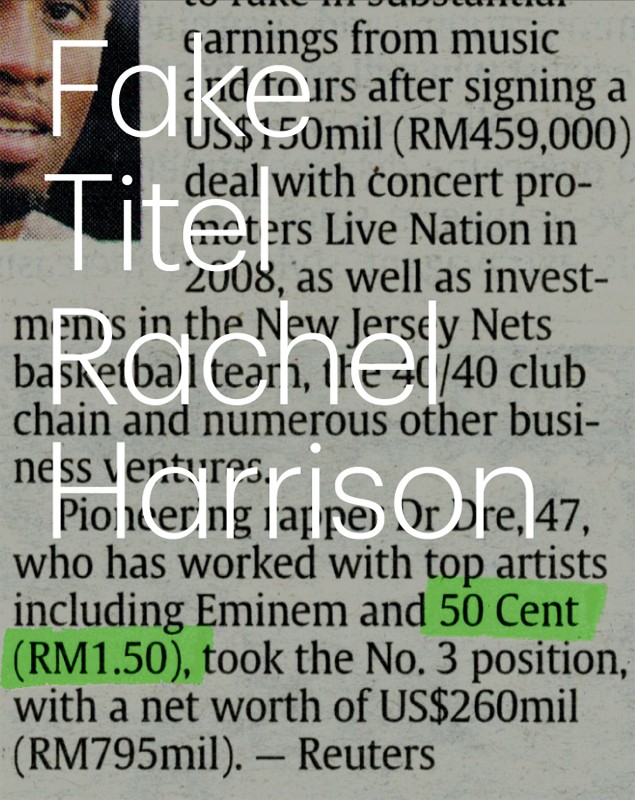
RACHEL HARRISON, MUSEUM WITH WALLS
Book Design
Rachel Harrison’s innovative use of sculpture is fundamental to a younger generation of artists. Harrions uses found or purchased objects (readymades) which she incorporates into her sculptures. A catalogue for her exhibition “fake title” at the Kestner Gesellschaft, Hannover, was created in close collaboration with the New York artist.
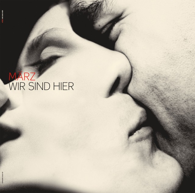

MÄRZ
Wir Sind Hier, Cover Design
Songs, which, for all the self-evident guise of High Pop, perpetually pose the question about positions, about themselves, itself, and thereby about me as well; songs, which circle around the question of position, of place and the quality of that place and thereby circle and encircle me until at some point or other (and almost automatically so), their question is my question: where am I – here? 2004
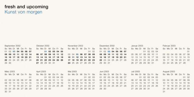
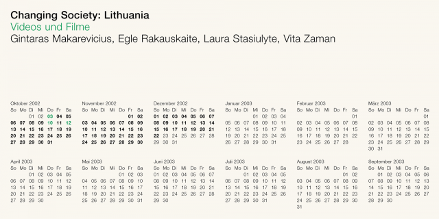
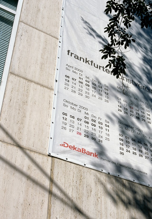
FRANKFURTER KUNSTVEREIN 2002/2003
Invitation Cards
An appropriate metaphor was the search for memory and a redefinition in the art debate in general. A calendar system was designed that brings together developments and events both in a general and concrete way. Dates and times are usually kept in the background. This calendar brings the background to the fore both graphically and thematically.
FRANKFURTER GOETHE NATIONAL MUSEUM
Exhibition Graphics
For the new permanent exhibition “Flood of Life – Storm of Deeds” at the Goethe National Museum in Weimar, Surface has been commissioned for the art direction, involving exhibition graphics and navigation, working along side a joined concept of the exhibition architecture by MINC and a scenographical space by Meso.
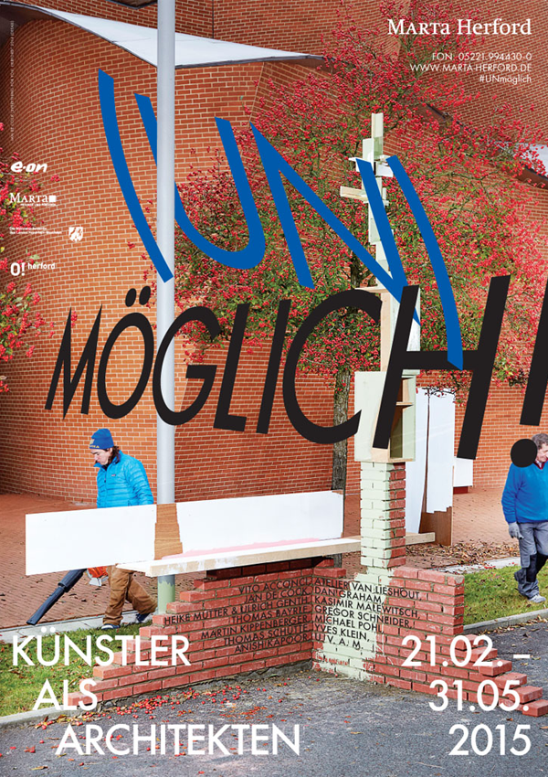
POSSIBLE! – ARTISTS AS ARCHITECTS
Exhibition Catalogue
For the first time, realized buildings and spaces, models and designs for possible buildings and utopian ideas and experiments, all of which are designed by creative artists, are presented in a comprehensive overview exhibition at Marta in Herford. Therefore Surface developed a magazine, that reflects the diversity of projects.
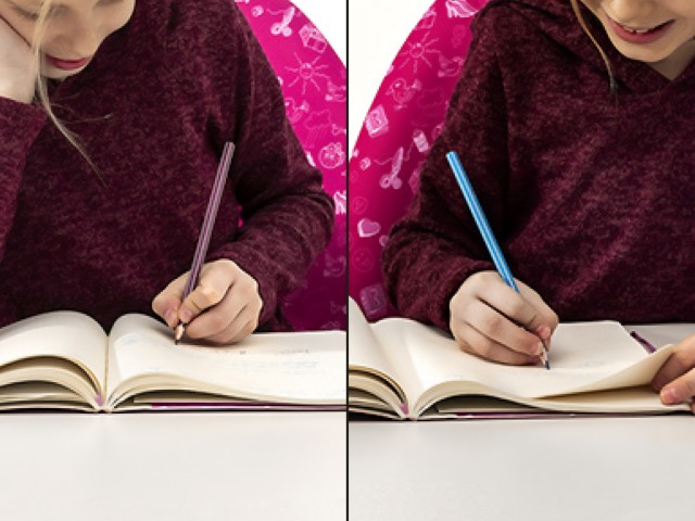
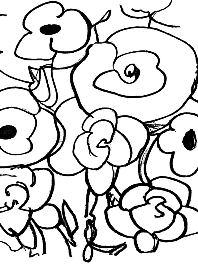
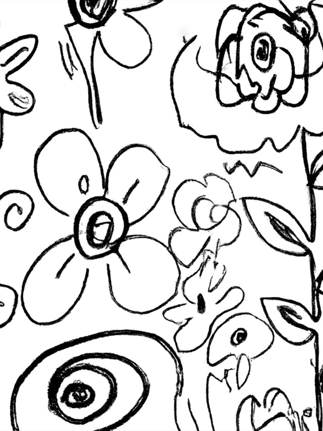
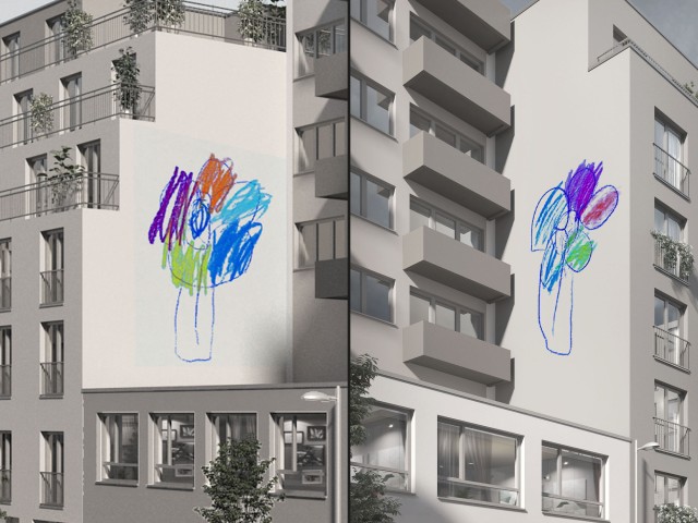
LEFT HANDED & RIGHT HANDED
Science Still Yearns to Know Why...
False leads and ever more complex hypotheses abound when scientists wonder why a minority of people are left-handed. Studies suggest that approximately 10% of people are left-handed, making left-handedness less common. Ambidexterity, which refers to having equal ability in both hands, is even rarer. Those who learn it still tend to favor their originally dominant hand, with about a 1% prevalence. Workshop for Ages 3 to 6: Drawing Flowers: In this session, children will draw flowers after carefully exploring the individual parts. The workshop is designed for ages 3 to 6.
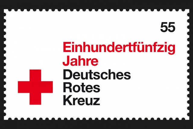
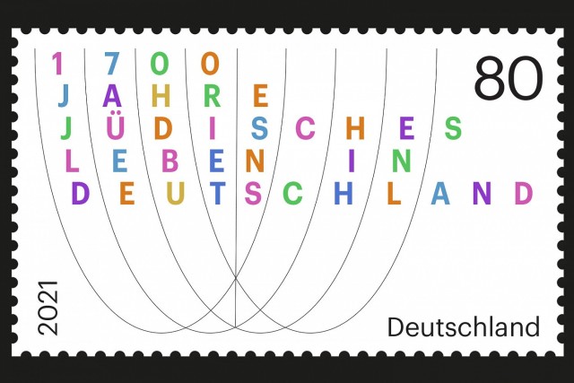
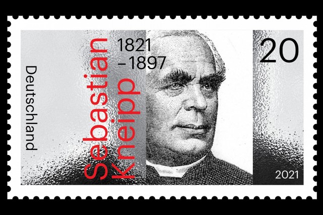
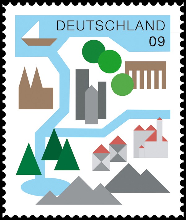
SONDERMARKEN
Different designs of special stamps for the Federal Ministry of Finance 2018 – 2020.
A commemorative stamp is a postage stamp, often issued on a significant date such as an anniversary, to honor or commemorate a place, event, person, or object. The subject of the commemorative stamp is usually spelled out in print, unlike definitive stamps which normally depict the subject along with the denomination and country name only.
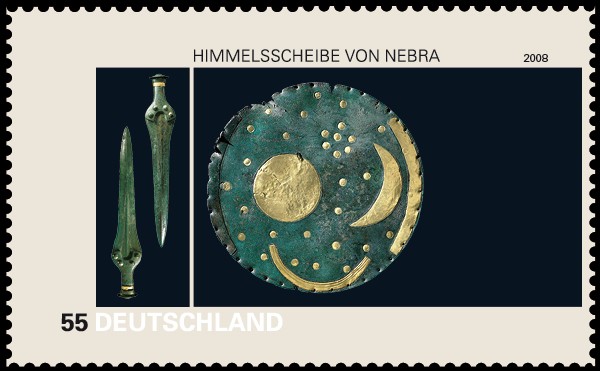
STAMPS DEUTSCHLAND/NEBRA
Stamp design
The sky disc is attributed to a site near Nebra, Saxony-Anhalt in Germany and during the bronze era dated ca. 1600 B.C. It is considered the world’s oldest, concrete depiction of the sky and as one of the most important archeological finds from this era. The theme of the stamp’s design illustrates an image of the sky disc as well as its burial objects.
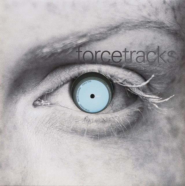
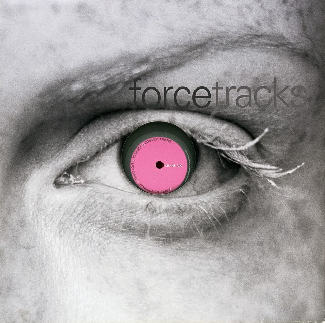
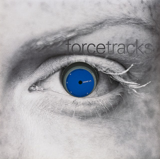
FORCETRACKS
Cover Design
Minimal deephouse and microhouse related sublabel of Force Inc. Music Works. Previous 5 year catalog distributed through EFA Medien GmbH, which is now defunct.
The re-release of force tracks (now, Digital Disco Inc / Disco Inc) This is the new label run by Achim Szepanski, the owner and creator of the Force Inc empire, since its inception back in 1990.
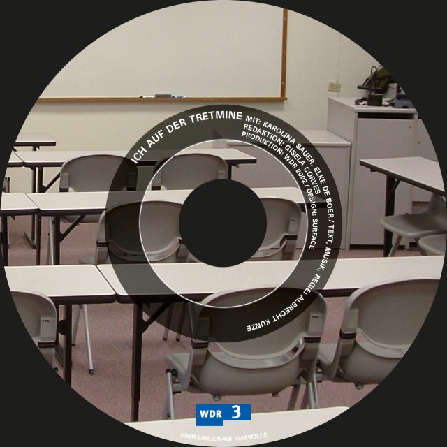
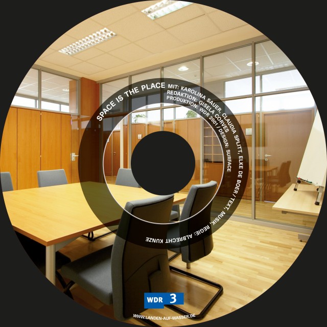
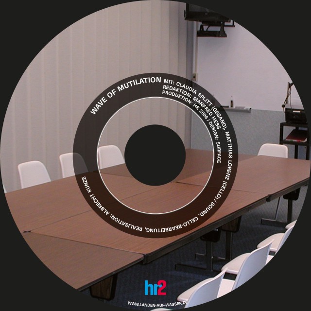
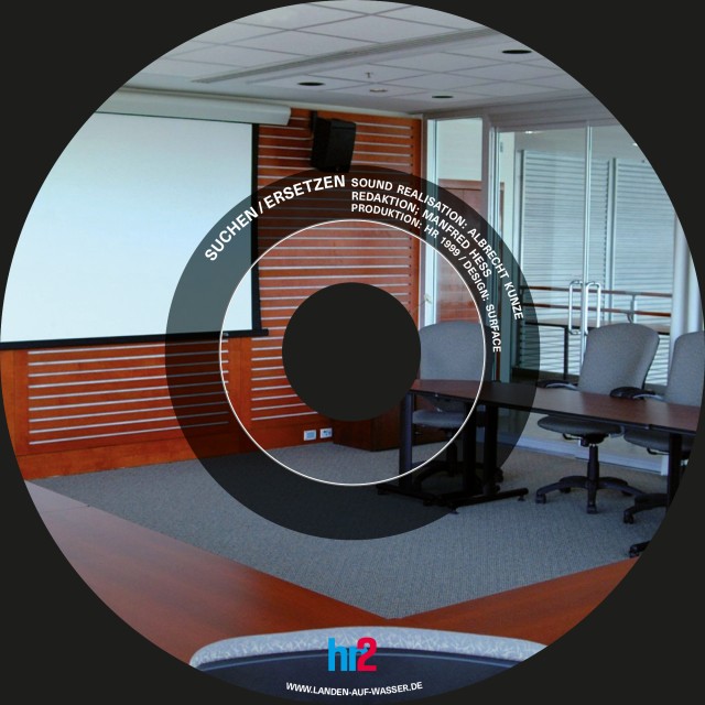
LANDEN AUF WASSER
Cover Design
LANDEN AUF WASSER ist Label und Lageplan zugleich. Hörstücke von Albrecht Kunze: CDs und Manuskripte, Texte und Kritiken. Dazu: Dinge über und unter der Oberfläche. Topographie der Landschaften und Geschehnisse, und: eine Karte im Maßstab eins zu eins.
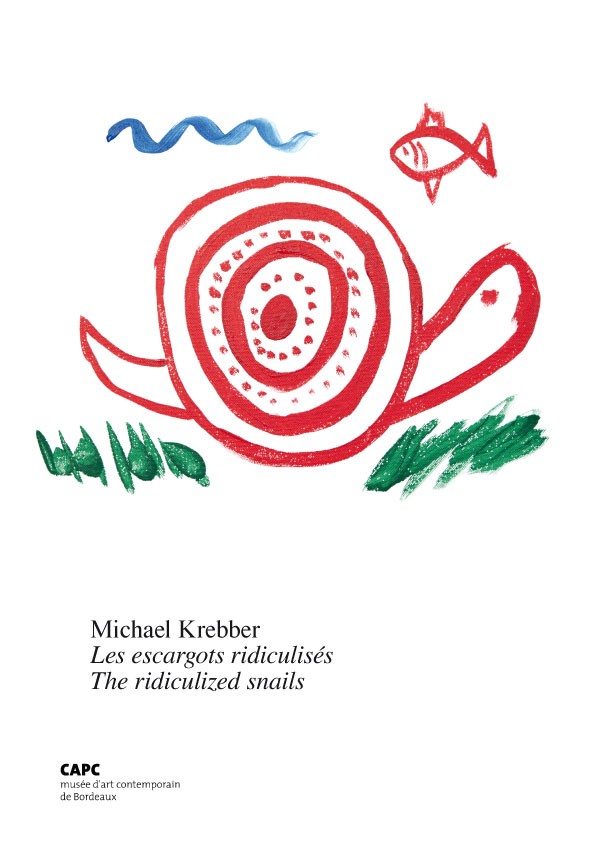
MICHAEL KREBBER
Catalogue, Editorial Design
Michael Krebber: Les escargots ridiculises / The radicalized snails published in conjunction with 2012–2013 survey exhibiton of same name at the CAPC, Bordeaux, France. The most comprehensive catalogue, to-date, covering the work and career of German artist Michael Krebber.
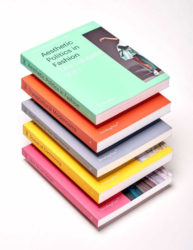
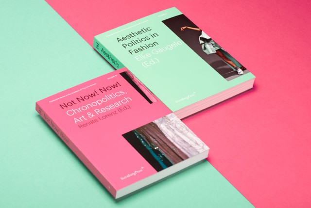
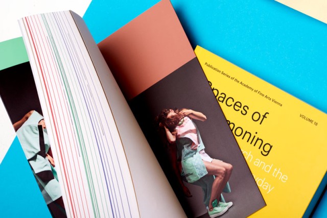
ACADEMY OF FINE ARTS VIENNA
Publication Series
The editorial design follows a strict grid with one Sans-Serif typeface as base for the structural elements of the different thematic chapters. The volumes in the series comprise collected contributions on subjects that are the focus of discourse in terms of art theory, cultural studies, art history, and research at the Academy of Fine Arts Vienna and form the quintessence of international study and discussion taking place in the respective fields.
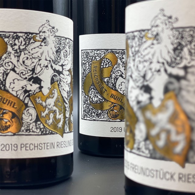
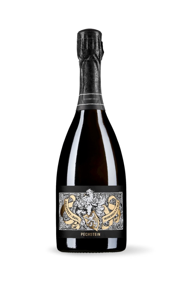
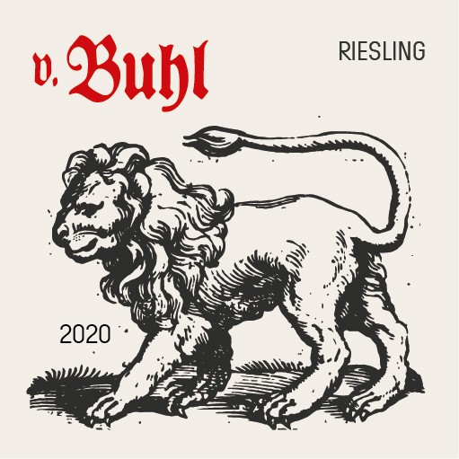
REICHSRAT VON BUHL
Corporate Identity
Rearrangement of the von Buhl brand.
Different representations of the heraldic animal with a revision of a Franz von Stuck design from 1917 as well as a new orientation of the Manufaktur wines by means of newly revised renaissance print graphics.
INSTITUTE FOR ART CRITICISM FRANKFURT AM MAIN
Corporate Design, Publication Series
Surface designed a series of books for the Institute for Art Criticism Frankfurt founded by Daniel Birnbaum and Isabelle Graw. It is published by Sternberg Press.
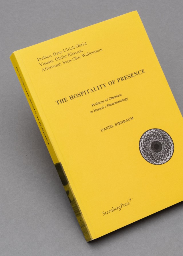
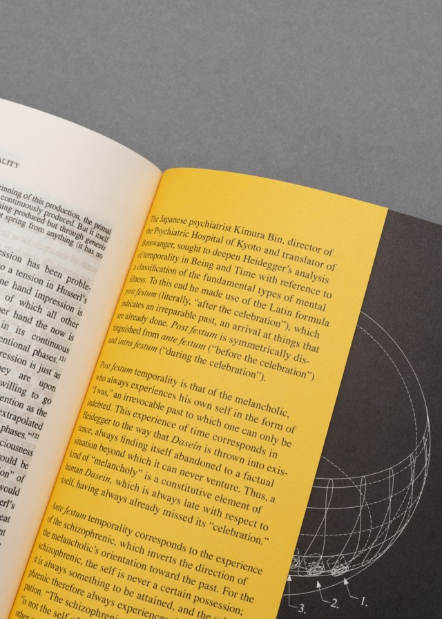
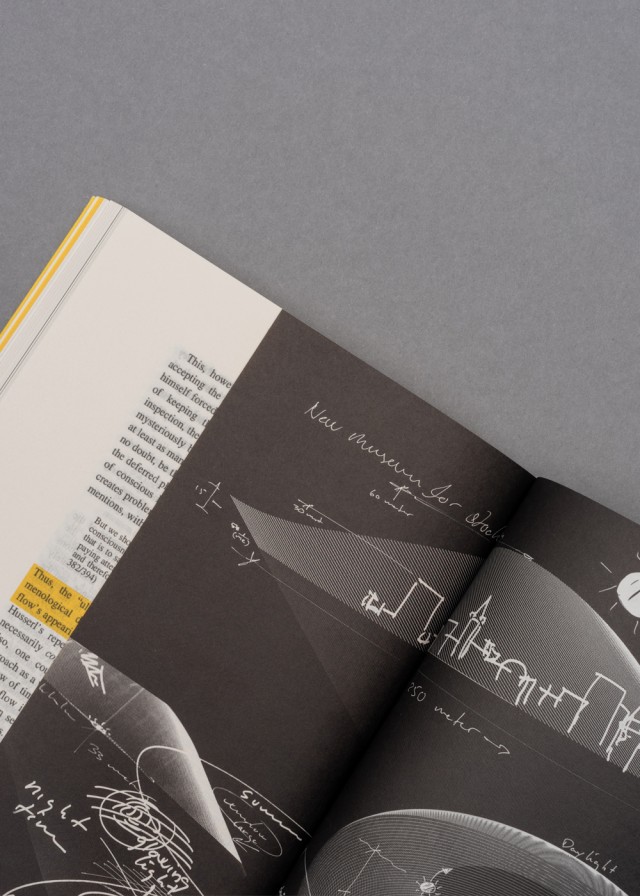
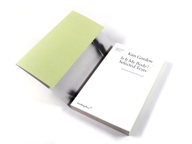
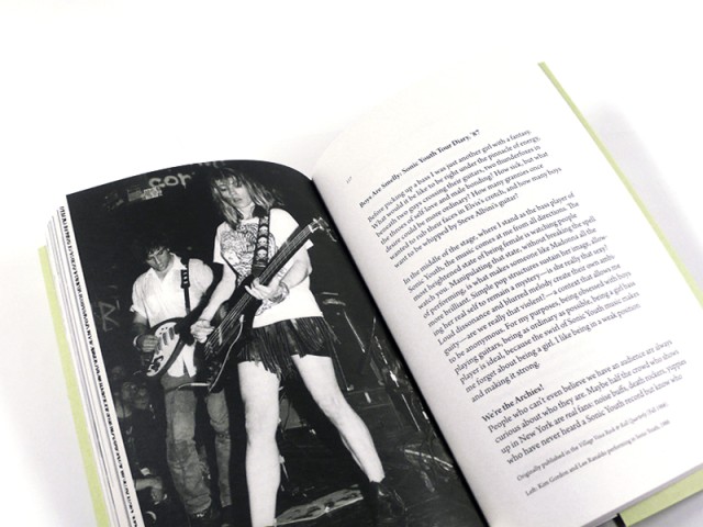
THE HOSPITALITY OF PRESENCE
Editorial Design, Publication
Daniel Birnbaum’s The Hospitality of Presence is a study of the concept of otherness in Edmund Husserl’s phenomenology. In the late 1990s it gained international attention in academic circles. It was reviewed favorably in specialized philosophy journals such as Review of Metaphysics and quoted extensively, most notably by Paul Ricoeur in one of the legendary French thinker’s last books. It has long been out of print. The Danish artist Olafur Eliasson has produced a special project for this new edition.
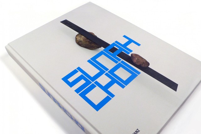
SUNAH CHOI 2018
Editorial Design, Catalogue
Artist Sunah Choi Sunah Choi is interested in processes of abstraction as applied to concrete moments in time, places, and phenomena.
Her sculptures, installations, and photographs probe the substance and formal structure of objects. By resolving observations into compositions and arrangements or condensing them in sculptures, she explores the aesthetic quality of selected aspects of nature and vernacular culture. Choi received Hannah-Höch-Förderpreis 2018, an award given out by the State of Berlin to a rising female artist in recognition of her growing oeuvre’s outstanding quality. This book, which contains three multipage inserts, presents a richly illustrated survey of Choi’s work of the past ten years, accompanied by a conversation between Sunah Choi, Thomas Bayrle Thomas Bayrle, and Markus Weisbeck. Markus Weisbeck With essays by Sabeth Buchmann and Andreas Schlaegel.